
Viz Mosart User Guide
Version 3.9 | Published November 04, 2019 ©
Quick Access Panel
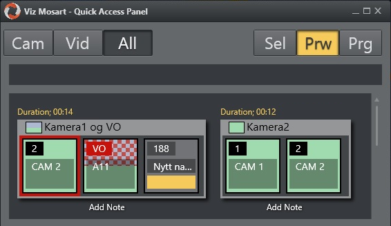
The Quick Access Panel (QAP) provides a compact view of the rundown content, and can be filtered to show only clips, or even just specific types of clips.
The Viz Mosart GUI provides several ways to control a newscast show. It will show a series of stories gathered from an NCS system. The rundown shows the rundown as it is planned by the Director. But the producer can divert from this plan by skipping stories or items in the rundown or bring in new elements. This is done by using keyboard shortcuts or by browsing through the rundown.
The purpose of the Quick Access Panel is to make it easier for the producer when producing a dynamic rundown. It can also be a convenient way for Co-Producers or Co-Pilots to add more content to a rundown while the Producer is running the show.
The Quick Access Panel control shows all the executable elements of the entire rundown as buttons grouped in the stories they originate from. It provides access to modifiable Story Filters, which the producer or co-pilot can use to find elements they want to add to a running rundown.
The Quick Access Panel can be operated from a second GUI or as a part of the main GUI. When using it as a secondary GUI, simply open another Viz Mosart GUI and create a new workspace. Make sure the new layout is saved. It can also be useful to create shortcuts to switch between workspaces.
This section contains the following topics:
Story Item
Story Control
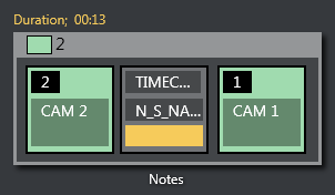
The Quick Access Panel shows each story as a rectangular box. Within the story container each element and sub-element is shown as a button. The Story type is indicated in the header by using the template color of the type of story element. The type of the story is determined by the elements it contains. Beneath the story box the user can enter text by clicking “Notes”.
The story item is always displayed within a story. The background of the button indicates the template type. The heading indicates template variant. A white text and red background as the Template variant text indicates an Unavailable template. The transparent text shows the slug.
The Quick Access Panel and the button sizes were designed with touch capabilities in mind.
You can take items (e.g. lower third, accessories, sound elements) on air by clicking the button. The button will get a red border and will appear in the program window. Take it off air by clicking the button again. Notice that if the item has a fixed time it will go off air by itself.
Note: Clicking an item that already has gone off air will put it back on air again.
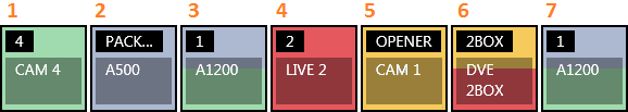
Primary Elements
-
CAM: Camera
-
PACKAGE: Video
-
VO: Voice over
-
LIVE: Live element
-
GRAPHICS: Full screen graphic element
-
DVE: Butterfly/DVE
-
FLOAT
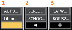
Secondary Elements
Secondary elements are shown with a gray background.
-
LOWERTHIRD
-
SOUND
-
ACCESSORY
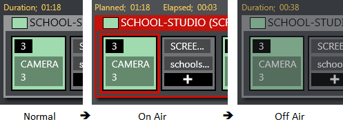
Story Status
If a story is on air its frame becomes red with white fonts. The item that is on air also get a red frame.
When the story, or story item, has been on air it gets a denser color.
If a lowerthird has continue points a bubble will appear on the right showing remaining continue points:
29-10-2015 09-47-07.png
Timing Information
Timing information is shown on top of stories:
-
Duration (normal): How long the story is planned to last
-
Planned (on air): The same as duration
-
Elapsed: How long the story has been on air
-
Duration (off air): How long the story lasted
Quick Access Panel Context Menu
Right-click the heading of a Story and select from the context menu options:
-
Set as next: this story will be set as next
-
Insert item: inserts all visible items (except floats) in the current order after the running item in the current story. If the command mode is Air Mode the first item will be taken directly.
-
Insert all items: inserts all items (except floats) in the story after the running item in the current story. If the command mode is Air Mode the first item will be taken directly.
-
Count down to: starts counting down to the first visible item in the story.
Command Mode
The result of pressing the Quick Access Panel buttons in the list varies depending on which of the command mode buttons is active
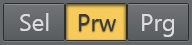
Sel - Select Mode
The item clicked will become the selected item. This item can then be sent to preview, program or wall by clicking the relevant control.
Prw - Preview Mode
The item clicked will be added to preview
Prg - Program Mode
The item clicked will go directly on air
If the user holds while clicking any of the boxed buttons, the boxed item will be sent-to-preview (as with the story items in the rundown).
Story Filters
An important part of the Quick Access Panel are the filters. By clicking on the different filters you can switch between various views. For example, you may have one for Cameras, one for Videos, one for Live and DVEs etc.
Add new filters by right-clicking and selecting Add. This is located to the right of the filter buttons if in Wrapped buttons view or below the filter buttons if in List Button View. Enter a name for the filter. Note that the first letter in the name is used as a key and must therefore be unique.
The Quick Access Tab shows the same filtered elements grouped in stories.
Filter Context Menu
-
Rename: Change the name of the filter
-
Add: Add another filter
-
Remove: Remove this filter
-
Move Left: Change the order of the filter left
-
Move Right: Change the order of the filter right
-
Items (header): the filters below are applied to the items within each story.
-
Show template types: Select which kind of template types that are visible when this filter is applied
-
Show items with status: Select which statuses the visible items can have:
-
Valid, Invalid (missing content etc), Aired (has been on air), OnAir (currently on air), Other.
-
-
Show items with template status: Select if items with Valid or Unavailable templates are allowed; or Both.
-
Add slug filter: Adds a slug filter.
-
Delete slug filter: Remove a slug filter by selecting from a list.
-
Show operator items: If you want to see elements added within the GUI check this option. If not, all elements added by the GUI operator will not be visible, only the NCS content will be shown.
-
Story (header): The filters below are applied to each story.
-
Show story types: Select which kind of story types that are visible when this filter is applied.
-
Show story with status: Select if items with the different statuses should be visible when this filter is applied.
-
Valid, Aired (has been on air), OnAir (currently on air), Preview (story is next), Other.
-
Example Filters
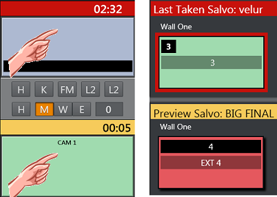
Show Missing Clips and Graphics: A filter to display the checkered clips or graphics in the rundown can be useful during a show to quickly verify if clips and graphics are available. It can also be very useful to add countdowns to these clips. The countdown will display how long until the clip has to be ready.
-
Show template types > PACKAGE, VO, GRAPHICS
-
Show items with status > Invalid
The countdown shown in the upper right corner can be set by right clicking the story.
Show Missing Templates: The filters can also be used to display missing templates. By applying the filter Show items with template status > Unavailable, the producer (or anyone using a GUI) can quickly spot any elements missing a proper template.
Show a Slug Filter: If the NCS Stories are using a kind of naming convention it can be easy to create container stories. For instance all highlights from a soccer match can be added to a specific story. Then by applying the slug filter “SOCCER_HIGHLIGHTS*”, all of these clips become available to the producer very quickly without having to scroll up and down the rundown. This approach also works very well with FLOATS (Adlibs) - clips.
Show Valid Floats: If the producer wants to have valid floats in the current on air story readily available, this filter can be used.
-
Show items with status > Valid
-
Show template types > FLOAT
-
Show items with template status > Valid
Show story with status > On-air Story Items