This section is the working reference for everyday use of Smart Panel: managing your panels, shaping the canvas, placing and configuring panel elements, binding buttons to Viz Mosart commands, and using a finished panel on air. It assumes you have followed Getting Started at least once and have a working connection to Viz Mosart.
Managing Panels
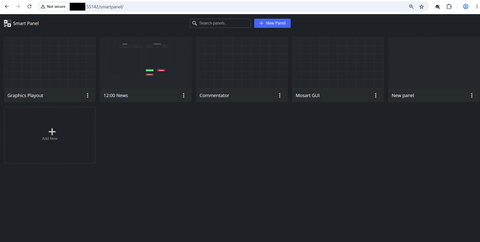
All panels live on the Mosart Web Server side, so anyone who can reach the Smart Panel URL sees the same list and works on the same files.
The landing page (/smartpanel) is the entry point for panel management.
Smart Panel ships with a small library of read-only preset panels (newsroom, multiviewer, commentator, etc.). Presets are not shown on the landing page and cannot be edited in place, they are available only as starting points in the New panel picker. Anything you create or duplicate from them is a normal, editable panel owned by your team.
From the landing page you can:
Create a new panel. Click New panel to open the panel picker. Choose Blank panel to start from an empty canvas (pick an aspect ratio here, since there are no widgets to suggest one), or pick one of the built-in preset panels (Mosart GUI, Multiviewer, Status Dashboard, Graphics Playout, 12:00 News, Commentator, Timing Display) to start from a ready-made layout. Give the new panel a name and click Create. Smart Panel opens it in the editor as a normal, editable panel. The original preset stays untouched.
Duplicate a panel. Use the per-panel menu on the landing page to clone one of your existing panels under a new name. To start from a preset instead, use the panel picker in New panel (see above); presets do not appear in the landing-page grid and cannot be opened or edited directly.
Open a panel for editing. Click the panel name/card (or the Edit action) to open it at
/smartpanel/<panel>/edit.Open a panel for use on air. Use the View action (or just navigate to
/smartpanel/<panel>without/edit) to open it full-screen without the editor chrome.Rename a panel. Open it in the editor and click the panel name in the app bar.
Delete a panel. Use the per-panel menu on the landing page. Deletion is permanent and removes the panel for every operator, so confirm before deleting a panel that may be in use.
Designing the Panel
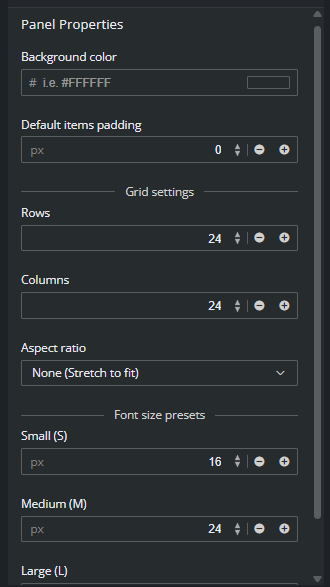
With no widget selected, the right panel shows panel properties. These settings shape the canvas itself and apply to the whole panel.
Panel properties
Property | What it controls |
|---|---|
Aspect ratio | The shape of the canvas. Pick a preset (16:9, 9:16, 16:10, 4:3, 1:1, ultra-wide, phone variants, etc.), set a Custom ratio, or pick None to stretch to fit the browser window. Match this to the target screen so the panel looks right on air. |
Grid (rows × columns) | How finely the canvas is divided. The default 24 × 24 suits most panels. Increase for fine-grained panels; decrease for chunky touch buttons. Widgets snap to cells. |
Background color | Solid color behind all widgets. Pick something that contrasts with your widget colors and is comfortable to look at during a long show. |
Default padding | Padding applied to new widgets. Individual widgets can override this in their own properties. |
Font-size presets (S / M / L) | Three named font sizes you can refer to from any widget. Set them once here, then pick S, M, or L on individual widgets instead of typing pixel values. Changing a preset updates every widget that uses it. |
Working with Panel Items
Panel items are the building blocks of a panel. The palette on the left has eight types (see section Item Reference below). Working with them on the canvas follows the same pattern regardless of type.
Adding an item. Click the type in the palette. The cursor arms with a preview. Click an empty cell on the canvas to drop the item. Smart Panel selects the new item and shows its properties on the right.
Selecting an item. Click it on the canvas, or click its entry in the panel Items list at the top of the right panel. The selected item shows its handles, and Element Properties opens below the list.
Moving and resizing. Drag the widget body to move it. Drag a corner or edge handle to resize. The widget snaps to the grid defined in Panel properties.
Panel Items list. Every placed widget appears in this searchable list. Use it when:
Added items overlap and you need to select one underneath another.
The panel is busy and you want to jump straight to a specific element by name.
You want to confirm what is on the panel at a glance.
Deleting a widget. Select it and press the delete key, or use the delete action in the layer list panel on the right.
Tip: Give items descriptive names in their properties (for example Take button, Story countdown). The panel Items list uses these names, so naming as you go pays off quickly as the panel grows.
Item Reference
The palette has eight item types. Each one has its own set of properties, but they all share the position, size, label, font-size and padding settings.
Item | What it is for |
|---|---|
Shows a live timer or countdown driven by Viz Mosart. Provides multiple, customized timing displays to build a timing display for the studio control room and studio floor. | |
Shows a live text value from Mosart. Some of the supported sub-types are: current/next item slug and story name, current/next video-server and graphics channels, rundown name, server description. | |
Static text that does not change at runtime. Use for section titles, group headers, on-screen instructions, branding. | |
Static image uploaded to the server. Use for studio logos, role icons, panel branding, background decorations. | |
Category that hosts built-in Mosart sub-widgets (Timeline, Story Script, Current Item Type, Next Item Type, Connection Status, Iframe, Device Statuses, Audio Toggles, Asset List, Video Transition). | |
Audio fader bound to a Mosart audio source. Drag the bar to change level on air. | |
The main interactive element. Sends a Viz Mosart command when tapped. | |
Embeds a live video preview. Three transports: NDI (via Coder), TriCaster input source, or an HTML video URL. Optional click-to-fire command. |
Binding Buttons to Viz Mosart Commands
Buttons are how operators drive Viz Mosart from a Smart Panel. Each button has a Command type that decides what it does when tapped.
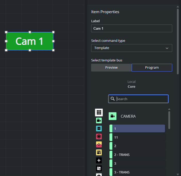
Template buttons. A Template button takes a Mosart template (camera, graphic, package, etc.) on the chosen output.
With the button selected, set Command type to Template.
Set Select template output to Program (take on air immediately) or Preview (cue to preview).
Open the template picker and choose the template the button should fire. The picker lists all templates available to Mosart.
Built-in command buttons. Built-in commands cover the standard Mosart actions that are not template takes: cue, transition, audio toggle, overlay control, timeline control, and so on. Pick the command from the Command type drop-down. The properties pane shows the parameters that command needs.
Confirm before send (optional). For destructive or irreversible actions, enable the confirm option in the button's properties. The operator sees a confirmation prompt before the command is sent.
Visual feedback. Use colors and label to make the button's purpose obvious at a glance.
Running a Panel On-air
When a panel is ready, open it in display mode: click View in the app bar, or navigate to /smartpanel/<panel> (without /edit). The editor chrome disappears and the panel is ready for the operator.
On-air behavior:
Timers, labels and indicators update live from Viz Mosart.
Buttons send their bound command immediately when tapped.
Faders apply audio level changes.
The Offline Mode badge appears if the connection drops. Live values are replaced with placeholders and buttons may fail until the connection comes back. See Setup and Administration of Smart Panel.
What to avoid while live:
Editing the panel the operator is currently using. Saves apply on next page reload, but unsaved changes in the editor are not reflected on the operator's screen, and an accidental misclick on the wrong button can fire a command.
Renaming or deleting a panel that is in use.
Touch operation tips:
Use a panel aspect ratio that matches the touch monitor. A mismatched ratio leaves dead bands at the edges that operators may tap by accident.
Avoid tiny widgets. Buttons smaller than a fingertip are unreliable under pressure.
Use clear color contrast between active states and idle states so the operator can see at a glance which action just fired.
Panel Item Types
The palette on the left of the editor has eight item types: Timer, Label, Text, Image, Widget, Fader, Button and Live. They fall into three groups: info display items (read-only, live data), interactive items (send commands or change values) and container items (host other content).
Item Reference is the quick lookup. This section is the deeper guide: when to use each type and the properties that matter.
Common properties and actions (all item types)
Every panel item, regardless of type or Widget sub-type, exposes the same set of base properties and the same action available in the panel items list. The per-type sections below describe only what is specific to that type; assume the common items here are always available.
Common properties
Custom name. Text shown in the panel Items list at the top of the right panel. Used to identify the item when many widgets are on the canvas. Also rendered on the item itself when Show name is on.
Show name. Toggle whether the custom name is rendered on the item.
Padding. Numeric padding (pixels) between the item's outer bounds and its content. Defaults to the panel-wide Default padding set in Panel properties.
Common action:
Delete, Copy and Duplicate
Timer
Shows a live timer or countdown driven by Viz Mosart. Synchronizes with the active Viz Mosart rundown and it can be customized to display user-specific details.
Use it for building a timing display for the studio control room and studio floor.
For example, one timing display can be running on the studio floor, connected to the in house intercom system. A second timing display is in the control room counting down packages, keeping the producer updated on the current show.
Timer types
Group | Types |
|---|---|
Current item | Current Item Countdown (default), Current Item Time |
Current story | Current Story Countdown, Current Story Planned Duration, Current Story Time |
Next | Next Break Time, Next Item Duration, Next Live Countdown, Next Story Planned Duration |
Rundown | Current Rundown Out, Rundown Elapsed Time, Rundown Over/Under, Rundown Out Over/Under |
Time / break | Time of Day, Time to Next Break, Time to Rundown Out, Duration to Next Break, Duration to Rundown Out |
Story Recorder | Story Recorder Preroll countdown, Story Recorder Recording time, Story Recorder Countdown |
Type-specific properties (in the order they appear in the pane):
Timer type. Drop-down with the 21 values above.
Show overtime background. Checkbox. When on, the timer changes its background color once it crosses zero (used with countdowns and over/under timers).
Background color. Hex (
#RRGGBB) text field, with a Make transparent checkbox (checked by default). Switching transparency off enables the hex field.Text color. Hex (
#RRGGBB) text field. Default#000000.Font weight. Radio: normal (default) or bold.
Text alignment. Radio: left, center (default), right.
Font size. Radio: S, M, L, Fit (default). The S/M/L values come from the Panel properties font-size presets. Fit auto-scales the text to the widget bounds and exposes the two fields below.
Min font size. Numeric, in pixels. Only relevant when Fit is selected; sets the floor of the auto-scale.
Max font size. Numeric, in pixels. Only relevant when Fit is selected; sets the ceiling of the auto-scale.
Plus the common properties
Good to know.
The default font-size mode is Fit. If you want a Timer to share a consistent size with neighboring widgets, switch it explicitly to one of S/M/L and avoid mixing Fit and preset modes side by side.
There is no per-threshold color. Over/under behavior comes from Show overtime background plus the background color you set, not from a separate "warning" or "critical" color.
In Offline Mode all 21 timer types show placeholder values. Do not rely on a timer's apparent behavior in the editor to validate a configuration. Always check in display mode with Mosart connected.
Label
Shows a live text value from Viz Mosart. Same role as Timer, but for text instead of time. Updates in real time.
Use it for current item slug, story name, next item slug, next story name, current and next video-server channels, current and next graphics channels, rundown name, and server description. Pick the value an operator needs to read at a glance during the show.
Label sources
Group | Sources |
|---|---|
Current | Current Item Slug (default), Current Story Name, Current Video Server Channel, Current Graphics Channel |
Next | Next Item Slug, Next Story Name, Next Video Server Channel, Next Graphics Channel |
Rundown / server | Rundown Name, Server Description |
Type-specific properties (in the order they appear in the pane):
Label. Drop-down with the 10 sources above. Equivalent to the Timer type drop-down on a Timer.
Show overtime background. Checkbox. Present on the Label pane but has no visible effect for a text label; it is meaningful for Timer only. Treat as a no-op for Label.
Background color. Hex (
#RRGGBB) text field, with a Make transparent checkbox (checked by default). Switching transparency off enables the hex field.Text color. Hex (
#RRGGBB) text field. Default#000000.Font weight. Radio: normal (default) or bold.
Text alignment. Radio: left, center (default), right.
Font size. Radio: S, M, L, Fit (default). The S/M/L values come from the panel properties font-size presets. Fit auto-scales the text to the widget bounds and exposes the two fields below.
Min font size. Numeric, in px. Only relevant when Fit is selected; sets the floor of the auto-scale.
Max font size. Numeric, in px. Only relevant when Fit is selected; sets the ceiling of the auto-scale.
Plus the common properties.
Good to know
The Label drop-down lists exactly the 10 sources above. There is no free-form expression and no way to bind a Label to an arbitrary Mosart value not on this list.
The Show overtime background checkbox is shared with Timer in the editor UI but has no effect on a Label. You can ignore it.
Long values can overflow a narrow widget. Either size the widget generously, switch to a smaller preset (S), or rely on Fit with sensible Min/Max bounds.
In Offline Mode, all 10 Label sources show placeholder strings. Verify the panel against a live Mosart connection before going on air.
Text
This is static text that does not change at runtime, and is only a design element. Has same styling controls as Label, but the value is typed by the panel author instead of being read from Mosart.
Use it for section titles (Cameras, Audio), group headers, on-screen instructions (Hold to confirm), branding (Studio 3), and any caption that the operator needs but Mosart does not provide.
Type-specific properties (in the order they appear in the pane):
Custom text. Free-form text field. Whatever you type here is what the widget displays on air. There is no formatting or markdown; it is rendered as a single string.
Background color. Hex (
#RRGGBB) text field, with a Make transparent checkbox (checked by default). Switching transparency off enables the hex field.Text color. Hex (
#RRGGBB) text field. Default#000000.Font weight. Radio: normal (default) or bold.
Text alignment. Radio: left, center (default), right.
Font size. Radio: S, M, L, Fit (default). The S/M/L values come from the panel Properties font-size presets. Fit auto-scales the text to the widget bounds and exposes the two fields below.
Min font size. Numeric, in pixels. Only relevant when Fit is selected; sets the floor of the auto-scale.
Max font size. Numeric, in pixels. Only relevant when Fit is selected; sets the ceiling of the auto-scale.
Plus the common properties.
Good to know
Text widgets do not update on air. If the value should change with the show, use a Label instead.
Long values can overflow a narrow widget. Either size the widget generously, switch to a smaller preset (S), or rely on Fit with sensible Min/Max bounds.
Image
Static image uploaded to the Mosart Web Server. Stored alongside the panel.
Use it for studio logos, role icons (a small camera icon next to camera buttons), background decorations, and any visual marker that helps an operator orient on the panel.
Type-specific properties (in the order they appear in the panel):
Upload image. Button that opens a file picker. The chosen file is uploaded to the server and reused across every device that opens the panel. Until an image is uploaded, the widget shows an info badge ("Image") on the canvas.
Fit. Drop-down with five values: None, Contain (default), Cover, Fill, Scale-down. Use Contain to letterbox inside the widget bounds, Cover to fill and crop, Fill to stretch, Scale-down for "Contain but never upscale", None to render at the file's intrinsic pixel size.
Background color. Hex (
#RRGGBB) text field, default#000000. Visible behind the image whenever the Fit mode leaves transparent space (most often Contain or Scale-down, or when the image itself has alpha). There is no Make-transparent toggle on Image; the field always holds a solid hex value.
Plus the common properties.
Good to know.
No Opacity property. To dim an image for a watermark effect, use a PNG with alpha baked in, or adjust the source file before uploading.
Keep image files small. Upload an image file in one of the supported formats: .jpg, .png, .gif, or .webp. The maximum allowed file size is 5 MB.
Widget
Widget is not a single item type. It is a category that hosts ten built-in Mosart sub-widgets. When you drop a Widget on the canvas, Item Properties shows a Widget type drop-down where you pick which sub-widget the item should render.
Each sub-widget has its own properties, shown below the drop-down, plus the common Widget properties (position, size, label, and so on).
Except for Iframe, all sub-widgets are Mosart-driven and need a live connection to show real data. In Offline Mode they show placeholder content.
Sub-type | What it shows |
|---|---|
Timeline | The Mosart timeline for the current story. |
Story Script | The script for the current story. |
Current Item Type | Visual indicator of the currently on-air item's type (camera, package, graphic, etc.). |
Next Item Type | Same, for the next item. |
Connection Status | Mosart server connection state, including main / backup beacon. The default sub-type when a new Widget is dropped. |
Iframe | Embeds an external URL inside the panel. |
Device Statuses | Live status indicators for connected Mosart devices. |
Audio Toggles | A group of audio mute / unmute toggles bound to Mosart audio sources. |
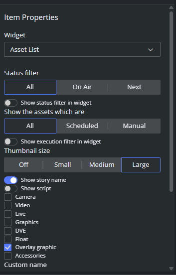
Asset List | Filtered list of story assets (cameras, videos, graphics, etc.) for the on-air or upcoming stories, with thumbnails and rich filtering. |
Video Transition | Picker for the next video transition (mix, cut, wipe, etc.). |
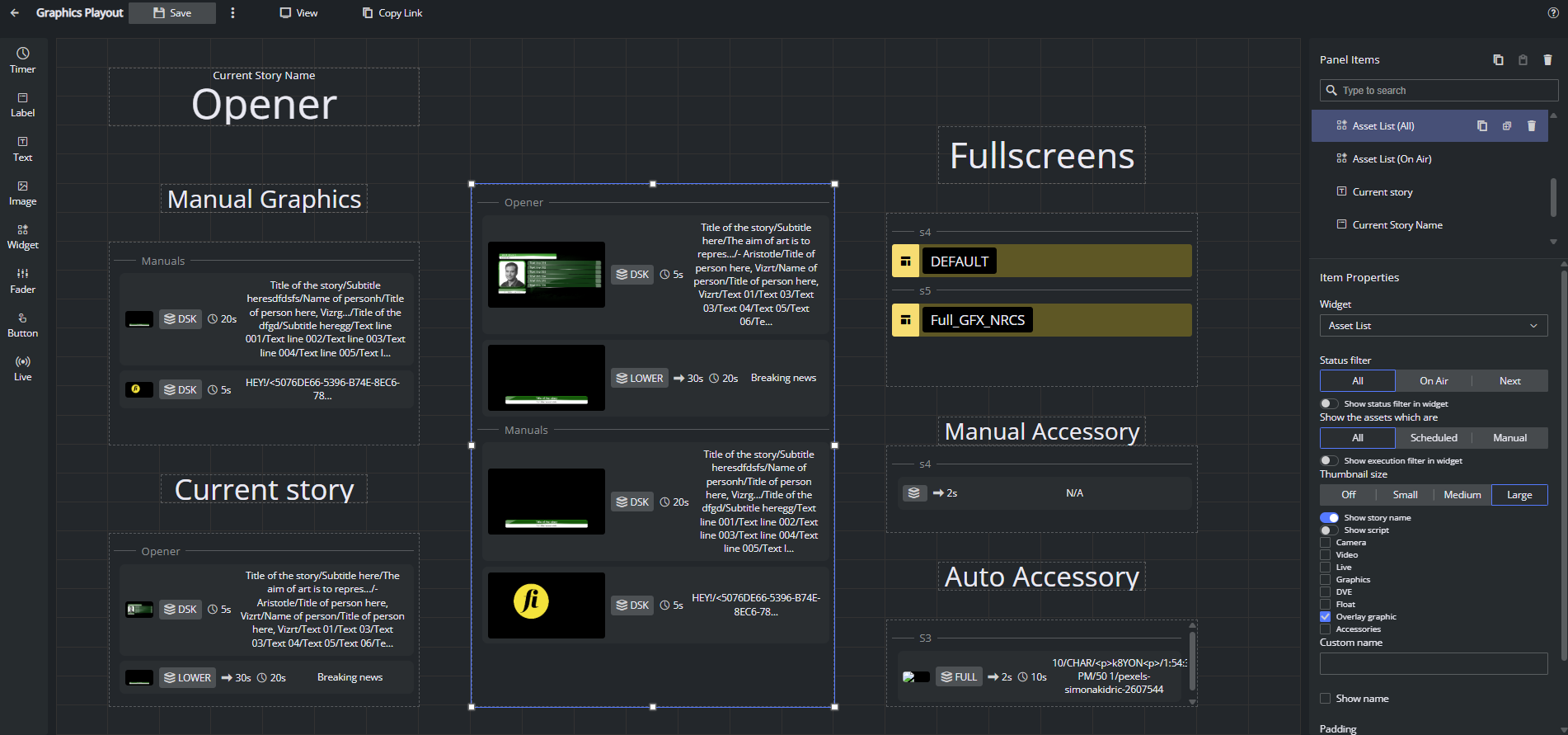
Example of a graphics playout panel with several Asset List widgets showing manual overlays, overlays on the current story, fullscreen graphics, and all graphics in the rundown:
Iframe sub-type
URL. The URL to embed. The frame is loaded directly.
Enable click action. When on, the iframe area is clickable as a unit. When off, clicks pass through to the embedded site.
Good to know
The embedded site controls whether it can be framed. If the site sets
X-Frame-Options: DENYor a restrictiveContent-Security-Policy: frame-ancestors, the iframe shows a blank or error frame and Smart Panel cannot override it.
Fader
Audio fader bound to a Mosart audio source. The operator drags the bar to change the level on air. Renders as a vertical bar with the source name at the top and the current level in dB at the bottom (shows -∞ when at the floor).
Use it for any audio source the operator needs continuous control over: presenter mic, music bed, remote feed level.
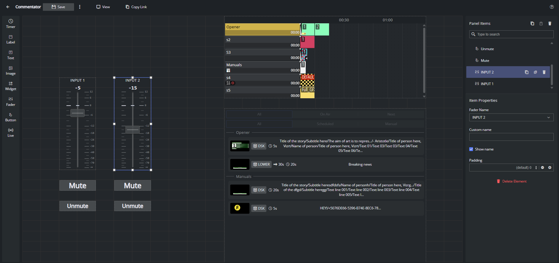
Here is an example of a Commentator panel: each commentator input has a vertical Fader widget with a live dB readout, plus Mute and Unmute buttons wired to the matching audio commands. Name each fader after its source (INPUT 1, INPUT 2, …) so operators can tell at a glance which channel they are riding.
Type-specific properties (in the order they appear in the pane):
Fader Name. drop-down populated from the live audio-channel list. The list contains exactly the channels Mosart Server is currently reporting (via
onAudioChannelsandonAudioLevel). In Offline Mode the drop-down is empty, so audio sources can only be bound when Mosart is reachable.
Plus the common properties
Good to know
The Fader Name drop-down depends on a live Mosart connection.
Button
The main interactive item. Sends a Viz Mosart command when tapped. Renders as a labelled button on the canvas, styled with the full color and font stack.
Use it for taking templates on Program or Preview, driving the timeline (reload, start, skip, start-from-top), and firing built-in Mosart control commands such as autotake, direct take, overlay graphics, audio actions, video-server goto, and the dozens of other commands the server exposes.
Type-specific properties (in the order they appear in the pane):
Label. The text shown on the button face. Defaults to
Button. Keep it short and unambiguous (TAKE,CUE,CAM 1).Select command type. Drop-down with exactly three values: Template (default), Timeline, Control Command. The fields below the drop-down change based on the choice.
Select template output (Template only). Radio: Preview or Program (default). Determines which output the template is taken on.
Template picker (Template only). A panel that lists every Mosart template by category (CAMERA, PACKAGE, VOICEOVER, OS, GRAPHICS, VIDEO EFFECT, JINGLE, PHONO, FLOAT, BREAK, VIDEOWALL, SOUND, ACCESSORIES) and lets you search and pick the template the button should fire. The picker reads the same template catalogue the rest of Mosart Web Apps uses.
Select timeline command (Timeline only). Drop-down with eight options: Toggle Rehearsal Mode, Reload (default), Start Continue, Skip Next, Unskip Next, Skip Next Sub Item, Unskip Next Sub Item, Start From Top.
Select control command (Control Command only). The full list of Mosart control commands, with
Start from topas the default. Use it to bind the button to the operation you want.Control command parameters (Control Command only). Free-form text field for command parameters in URL query format (
param1=value1¶m2=value2). Required by some commands (for exampleengine_switcherneeds an engine name); leave blank for commands that take no parameters.Test action. Button at the bottom of the command section. Fires the configured command from the editor without switching to display mode. Use it to confirm the binding works before going live.
Background color. Hex (
#RRGGBB) text field with a Make transparent checkbox. Defaults to#464a4d(dark grey) with transparency off, so buttons are visible against any panel background out of the box.Text color. Hex (
#RRGGBB) text field. Default#000000.Font weight. Radio: normal or bold (default). Button is the only type where bold is the default.
Text alignment. Radio: left, center (default), right.
Font size. Radio: S, M, L, Fit (default). Same Min/Max font size fields appear when Fit is selected.
Min font size / Max font size. Numeric, in px. Only relevant when Fit is selected.
Plus the common properties.
Good to know
Control Command values are sent verbatim to Mosart Server. A typo in the parameters field (or a parameter the command does not understand) fails silently from the operator's point of view; check the Mosart Server log if a button does nothing.
The Test action button fires the real command against the connected Mosart Server. Do not click it during a live show unless you mean to.
Live
Embeds a live video preview on the panel. Supports three source types: NDI sources discovered from the Coder service, a TriCaster WebSocket feed (the video_notifications stream), or any HTML Video URL the browser can play.
Use it for camera previews, NDI source previews, TriCaster feeds, and any other low-latency picture the operator needs to glance at.
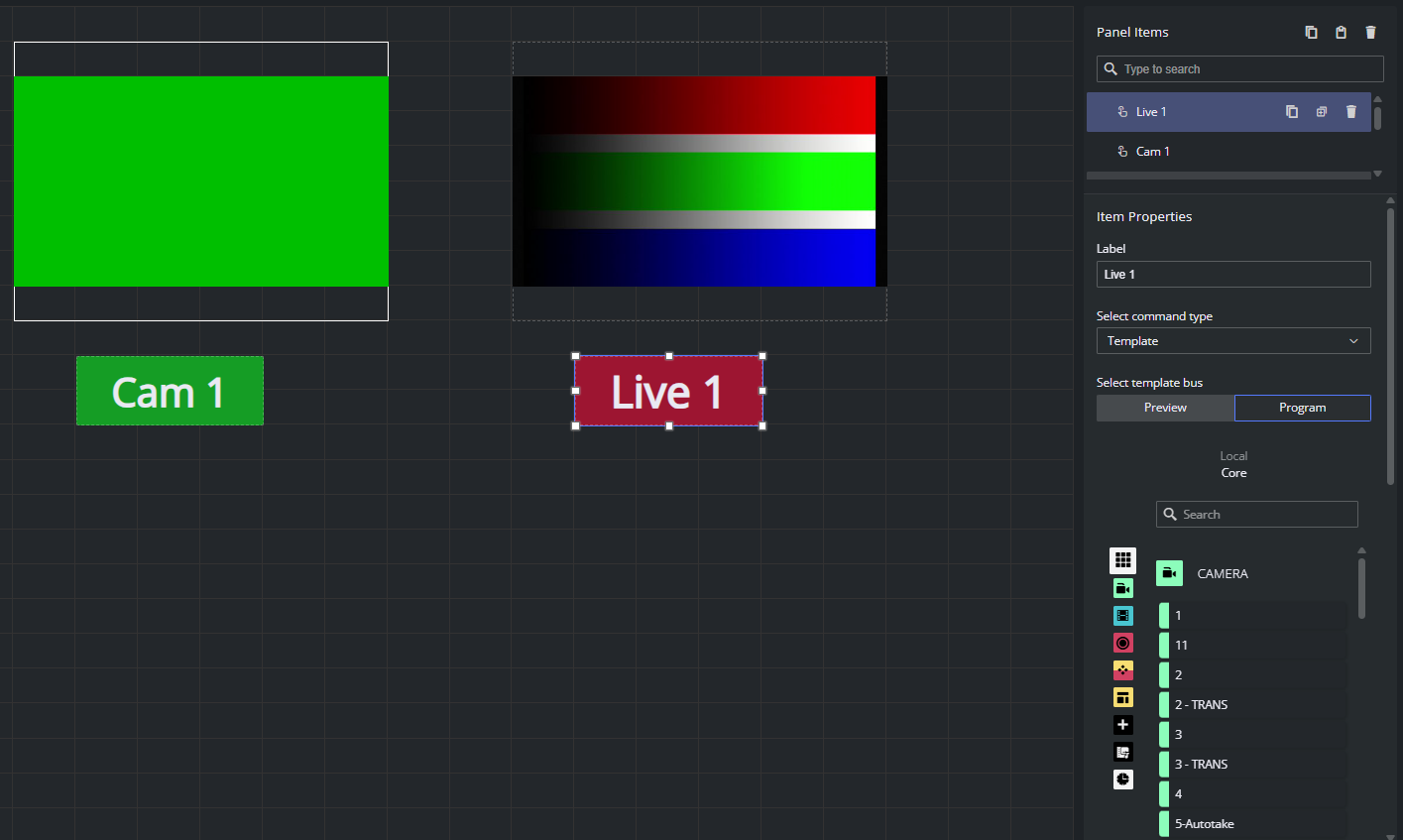
Here is an example of a simple Multiviewer-style panel: two Live widgets display the feeds from two TriCaster inputs (Cam 1 and Live 1) so the operator can preview both sources side by side, and the two Button widgets below them are bound to Template commands on the Program bus that take the matching source on air with a single click. Pair each Live preview with its own take button and label both with the same source name so the link between what you see and what you cut to is obvious.
Type-specific properties (in the order they appear in the pane):
Source type. Segmented control with three values: NDI (default), JPEG Stream, HTML Video. The field below the segmented control changes based on the choice.
Select live source (NDI only). Drop-down populated from Coder. Smart Panel calls Coder's
web_preview/endpoint, parses the XML, and lists every input whose URL starts withndi://. If Coder is not configured or returns no NDI inputs, the placeholder reads No sources available and the drop-down is disabled.Select TriCaster input (TriCaster only). Drop-down populated by Smart Panel from the TriCaster server configured in Mosart Web Config Tool. If the host is not configured the drop-down is empty and the pane shows a hint to configure it; if the host is set but unreachable or rejects authentication, the drop-down is empty and an error is shown.
HTML video source (HTML Video only). Free-form text field. Expects a URL pointing to a file the browser can play in a
<video>element. Supported formats:.mp4,.webm,.ogg,.ogv.Enable click action. Checkbox. When on, the Live widget doubles as a button: the same Select command type / template bus / template picker / timeline command / control command / parameters / Test action sub-pane that the Button widget uses appears below the checkbox. When off, clicks on the preview do nothing.
Plus the common properties.
Good to know
The NDI source list comes from Coder over plain HTTP (
web_preview/). If Coder is unreachable the drop-down stays empty and the editor logsFailed to fetch sources - no coder service available.
See setup instructions in section Coder for Live Previews.A configured Live widget that cannot reach its source (Coder down, TriCaster off, video URL 404) shows an empty or broken frame.
Coder may publish duplicate previews for the same source; Smart Panel de-duplicates by URL before showing the drop-down, so the operator sees each source once.
The TriCaster input list comes from the TriCaster server configured as described in section Mosart Web Apps Config Tool.
If the host is empty, unreachable, or rejects the credentials, the drop-down stays empty and the editor surfaces the reason.