This page walks you through opening Smart Panel, recognizing the main views, the core terminology, and building and running your first layout. For an overview of what Smart Panel is and where it fits, see the Smart Panel parent page.
Open Smart Panel
Smart Panel runs in a web browser. Open it at http(s)://<server>:55142/smartpanel (port 55143 for HTTPS), where <server> is the hostname or IP of the Mosart Web Server.
Users can also open Smart Panel from the app launcher in the Mosart Web Apps Configuration Tool.
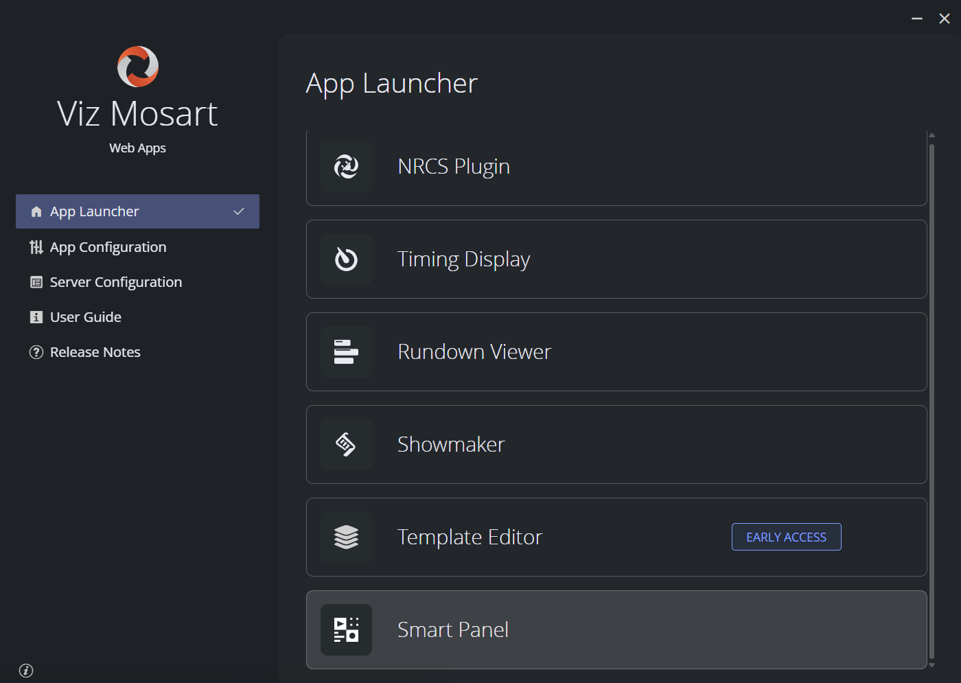
Smart Panel is one of the Mosart Web Apps, so the same host serves the other apps in the suite, switching between them does not require signing in again.
Signing in. Whether you need to sign in depends on how your administrator configured Mosart Web Apps:
Authentication off (default install): You reach Smart Panel without signing in. Layouts can still be created and saved, but command buttons may not reach Mosart Server if it requires an API key.
Authentication on: The first time you open the page, you are redirected to your organization's identity provider and signed in there.
There are no Smart Panel-specific roles today. Anyone who can reach the URL can create, edit and run layouts.
If Smart Panel opens but the Offline Mode badge stays on in the app bar, the connection to Viz Mosart could not be established. See Setup and Administration of Smart Panel and the troubleshooting notes there.
Tour of the Interface
Smart Panel has three main views.
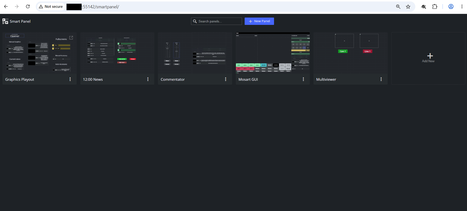
Landing page (/smartpanel) : list of saved layouts. From here you create a new layout or open an existing one for editing or for use on air.
Layout editor (/smartpanel/<layout>/edit) : where you design a layout. Has four areas:
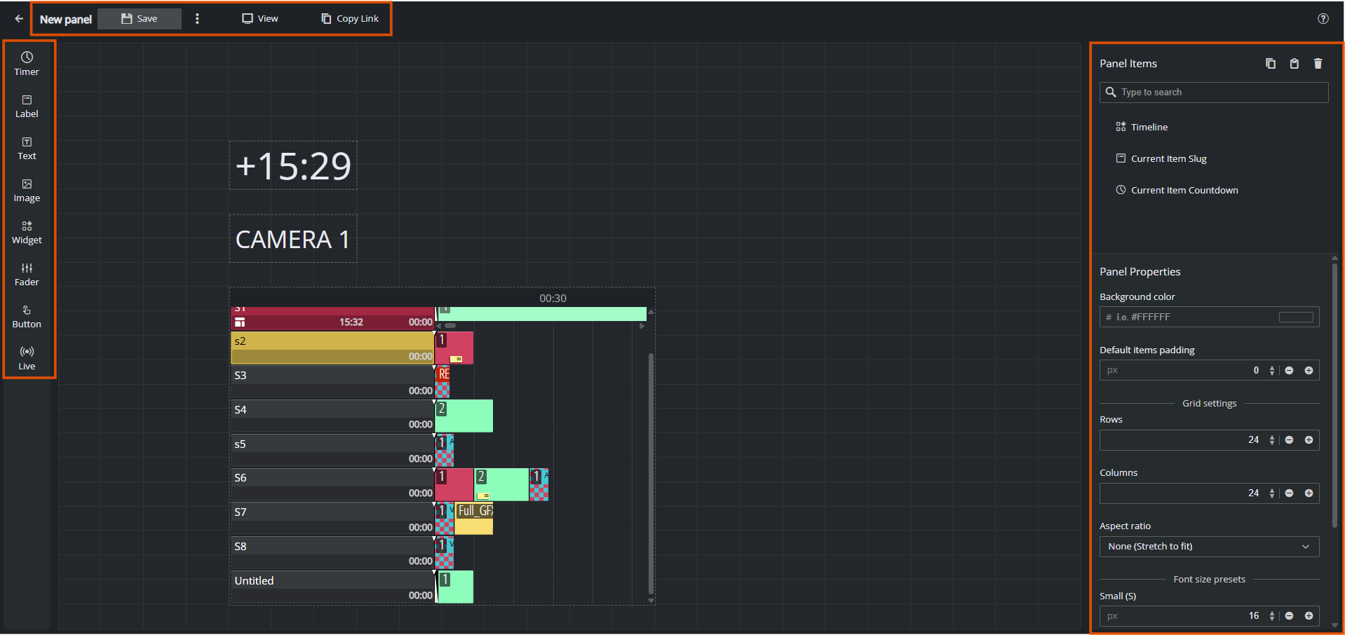
App bar (top) - back arrow, Offline Mode badge when Mosart is unreachable, layout name (click to rename), Save, more-options menu, View (opens the layout in display mode in a new tab), Copy Link, and the ? help icon.
Layout items palette (left) - the eight item types you can drop on the canvas: Timer, Label, Text, Image, Widget, Fader, Button, Live.
Canvas (center) - the layout grid. Click an empty cell after arming a widget to drop it; click an existing element to select it.
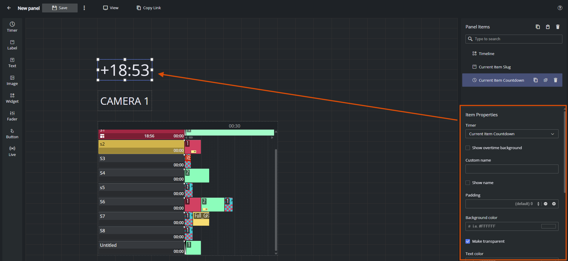
Properties panel (right) - splits into Layout Items (top, a searchable list of every placed element) and the property editor (bottom). The property editor shows Layout Properties when nothing is selected, and Item Properties for the currently selected widget.
Layout display (/smartpanel/<layout>) - the same layout without the editor chrome: full-screen, touch-friendly, suitable for the operator's screen on air. Open it via the View button in the editor, or just navigate to the layout URL without /edit.
Help menu - the ? icon in the top-right of every page opens the help menu:
Option | Opens |
|---|---|
Documentation | This Smart Panel user documentation. |
What's new | Release notes for the current version. |
Give feedback | Email link to the Smart Panel team ( |
About | Smart Panel version and build information. |
User avatar - when you are signed in, your avatar appears in the top-right next to the help icon. Click it to see your account and to Sign out. Smart Panel shares its identity provider with the other Mosart Web Apps, so signing in or out in one app applies to the others in the same browser session.
Key Terms
Term | Meaning |
|---|---|
Layout | A single panel design: a grid of widgets plus its own name, aspect ratio, background, padding and font-size presets. |
Element | One item on a layout - a button, timer, label, image, fader, etc. |
Edit mode | The layout open at |
Display mode | The layout open at |
Grid | The rows × columns the canvas is divided into (default 24 × 24). Widgets snap to cells. Configure rows and columns in Layout Properties. |
Aspect ratio | The shape of the canvas. Choose a preset (16:9, 9:16, 16:10, 4:3, 1:1, ultrawide and phone variants, etc.), set a Custom ratio, or pick None to stretch to fit. Set per layout in Layout Properties so a layout looks right on its target screen. |
Layout Properties | Panel shown when no widget is selected. Controls background colour, default padding, grid size, aspect ratio and font-size presets (S / M / L) used by widgets that pick a preset. |
Element Properties | Pane shown when a widget is selected. Controls the widget's text, colour, font, padding, command binding (for buttons) and any type-specific options. |
Layout Items | Searchable list of every widget on the layout. Useful when widgets overlap or the layout is busy. |
Offline Mode | Badge in the app bar. Means the connection to Viz Mosart is not established. Live data is replaced with placeholder values so you can keep editing. See Setup and Administration of Smart Panel. |
Your First Layout
A 5-minute walk-through that uses every core concept once. It assumes Smart Panel is connected to a working Viz Mosart system (see Setup and Administration of Smart Panel). If the Offline Mode badge is on, you can still complete the design steps- only the on-air step at the end needs a live server.
Open Smart Panel and create a layout. From the landing page, click New Layout, name it My first panel and click Create. Smart Panel opens the new layout in the editor at
/smartpanel/my-first-panel/edit.Set the canvas shape. With no widget selected, the right pane shows Layout Properties. Pick an Aspect ratio that matches your target screen (for example 16:9 for a landscape touch monitor). Leave the grid at 24 × 24 for now.
Add a Take button. In the palette on the left, click Button. The cursor arms with a button preview. Click an empty cell near the bottom of the canvas to drop it. Smart Panel selects the new button and opens its Element Properties on the right.
In the properties pane, set:
Label: Take
Command type: Template
Select template bus: Program
Pick any template from the picker that opens (for example a
CAMtemplate). Close the picker.
Add a story countdown. Click Timer in the palette, then click a cell at the top of the canvas. In Element Properties, pick Current Item Countdown as the timer type. The widget immediately shows a placeholder countdown (or a live one, if Mosart is connected).
Add a label. Click Label, click a cell next to the timer, and in Element Properties pick Current Item Slug so the widget shows the name of the on-air item. Set Font size to M.
Save. Click Save in the app bar. The button greys out, meaning the layout is saved to the server. Anyone who can reach the URL can now open it.
Open it on air. Click View in the app bar (or open
/smartpanel/my-first-panelin a new tab). The layout fills the screen, ready for the operator. Tap the Take button, if Mosart is connected, it sends the template you bound in step 3.
You have now built and operated your first Smart Panel layout. To go deeper into any step, see Working with Smart Panel.