
Viz Ticker User Guide
Version 4.0 | Published June 29, 2021 ©
Viz Ticker Web Client
The Viz Ticker Web Client allows journalists and operators to access tickers remotely. It runs in any modern browser, on any device. The Ticker Web Client is hosted at the URL http://mse-host:8580/app/ticker/ where mse-host is the hostname or IP address of the Media Sequencer hosting the web application. The Ticker Web Client is a companion app to the desktop client. This means that the web client is not feature complete compared to the desktop client, but aims to provide the most used functionality to operate a ticker system on a daily basis. These are the main functions:
Carousels (Pool and Active)
The Carousels

The tab list below the logo is populated with the carousels on this Ticker system. Click each tab to display a carousel.
The Pool
The left side of the window contains the pool of inactive elements for the carousel. New elements are added to this list by default, unless the Active carousel is set to default in Ticker Wizard. To activate an element, drag it over to the Active Carousel. The Pool can contain elements, sections and groups.
The Active Carousel
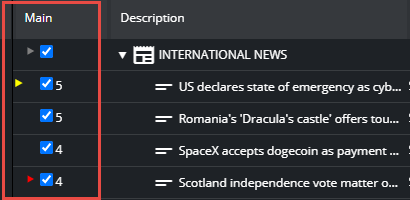
The right side of the window contains the Active Carousel. These are the elements of an active, running carousel. Each output channel has its own column in the Active Carousel. The default output channel is called Main. In this column, it is possible to track the cursor of elements:
-
Gray cursor: The section having the active, playing element.
-
Red cursor: The active, playing element.
-
Yellow cursor: The next element, if manually set.
The checkbox in this column indicates whether the element is active. If not, the element is not displayed. The Number to the right of the checkbox indicates the number of times this element has run.
Adding and Modifying Elements
To add new content into the carousel, click one of the following buttons:
![]()
From left:
-
Add a new element based on the default template for this carousel.
-
Add a new element, and select from the available templates for this carousel.
-
Add a group.
-
Add a section.
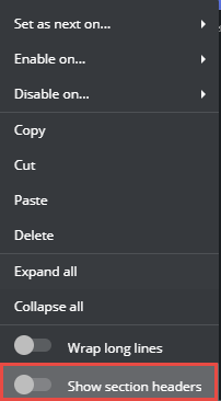
A section is a group with two sub groups: Section heads and section elements. This is handy when a section should display a mandatory section element before the actual section elements. The section headers can be shown or hidden in the active playlist by right clicking a section and enabling or disabling Show section headers.
Layout Editor
When adding or modifying elements, the ticker element editor appears with a default layout. This layout is auto generated based on the fields in the template. It is possible to change this layout.
-
Add a new element based on the template you want to change.
-
Click the Edit Layout button in the lower right corner of the editor:

Now you enter layout mode. In this mode it is possible to:
-
Resize and move input widgets. The layout is column based to be responsive when the panel aspect and size change, so it is not possible to freely adjust size and position. The adjustments snap to an invisible grid.
-
Edit label of input widgets.

When done changing the layout, click Save Layout. To discard the layout changes, click Discard, The layout is now changed for all elements based on this template.
Control, Handlers, Users
These functions are for more advanced users.
Control
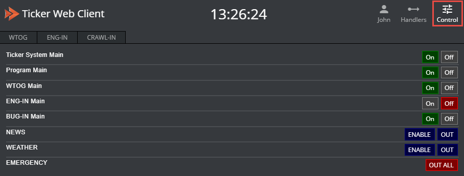
By clicking the Control button on the toolbar, a panel appears with all the Ticker buttons. The system buttons are as follows:
-
For each output channel (default channel is called Main) there are on/off buttons for:
-
Ticker System: Enabling or disabling the Ticker system for this channel.
-
Program: Sending the background scene to the renderer, preparing the visual layout of the Ticker
-
-
For each carousel: Starting and stopping each carousel with the animation designed by the scene designer
-
Custom: In the Ticker Wizard it is possible to create new Button Groups with custom buttons. These buttons do not have a state (on or off), and they are displayed default in blue color.
Handlers
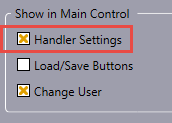
This function must be enabled in Ticker Wizard > Settings > Show in Main Control:
If enabled, a button on the toolbar appears. When clicking it, a dialog appears with the list of Media Sequencer handlers used by this Ticker system:
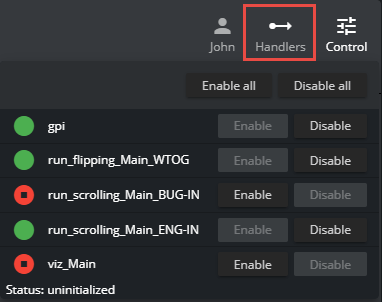
The Media Sequencer handlers are the mechanisms in use when the Ticker system is running. There are handlers for GPI trigging, carousel handlers and Viz Engine handlers. Normally these handlers should be enabled (green), but in some cases it may be necessary to restart a handler (disable and re-enable it). The handlers also provide a low level message of their state. This information and this functionality is usually needed only by system administrators.
Users
This function must be enabled in Ticker Wizard > Settings > Show in Main Control:
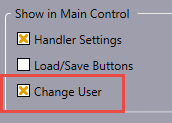
If enabled, the user name is editable from by clicking the user icon in the header menu. A dialog pops up prompting for a user name:
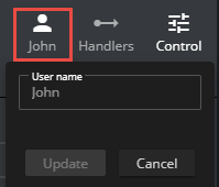
This user name is used to add a personal tag to each element, on who created it:
