
Template Builder User Guide
Version 2.1 | Published July 26, 2021 ©
Data Entry
The Data Entry field property specifies how users should fill in field values:
Manual
Selecting Manual in the Data entry drop-down list does not give access to any additional settings for the field.
Choose From List
Selecting Choose from list lets you see the content in a drop-down list, which may in some cases make it easier and less error-prone to fill the template in with the right content.
For example, when a Control Object moving (Omo) plugin is accessible in the template, scenes using Omo plugins are originally presented as integer values for the different elements in the Fill In Form. The Choose from list option can assign text to these values to make it easier to select the right element.
The example below contains a scene that can be displayed at the top, in the middle or at the bottom in the graphics. For the Omo plugin, these positions correspond to the values 0, 1 and 2 respectively. To assign text to these values:
-
Mark the Omo Field ID in the Field Tree.
-
Select Choose from list in the Data entry drop-down list.
-
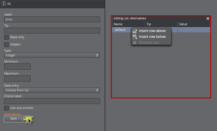
Click Alternatives. A new window appears. Right-click to insert or remove rows. Click a selected row or press F2 to do inline edits.
-
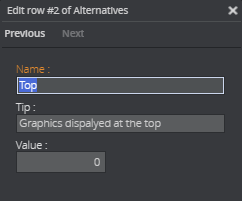
Double-click the table or press Return to insert Name, Tip, and Value. Click Next, tab or CTRL + DOWN ARROW, to continue filling the table.
-
The values now correspond to text in the table below. Exit the table completely.

-
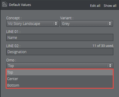
The Omo field in the Fill In Form now contains a drop-down list containing the alternatives created above as text, as opposed to an integer field where the user would have to remember which integer corresponds to which position.
Using Sub-Choices
If you select the Choose from list option, a checkbox is made available called Use sub-choices, which lets you set multiple sub-choices for each choice.
For example, if the choices list different countries, sub-choices could list cities in each of the countries.
-
Mark the desired Field ID in the Field Tree.
-
Select Choose from list and tick the Use sub-choices check box.
-
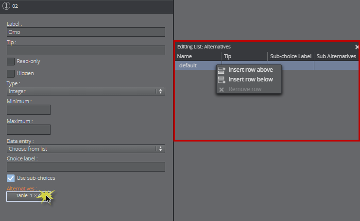
When clicking on the Alternatives button, a new window appears. Right-click to insert or remove rows:
-
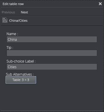
Double-click the table to insert Name, Tip and Sub-choice Label, in this example Cities:
-
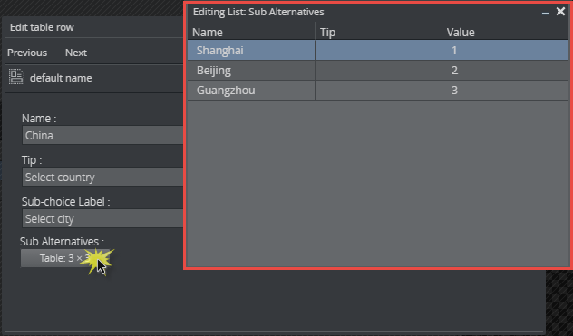
Click the Sub Alternatives button to add the sub-alternatives.
-
Exit the tables when complete.
-
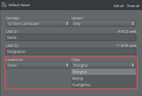
Instead of a text field in the Fill In Form, the field now contains two drop-down lists: the main choices, which in this case is a list of countries, and sub-choices, with corresponding cities.
Enable Feed Browser/Parent Feed Browser
This option specifies that the field should get its value from a property of an atom feed entry. If the field is a sub-field of another field that has enabled feed browser, the option is named Parent feed browser. Otherwise, it is named Enable feed browser.
-
If the Enable feed browser option is selected, a Browse button appears next to the field in the fill-in form.
-
Click Browse to open the Feed Browser dialog.
-
In the Feed Browser, the atom entries of the feed are presented (with thumbnails, if available), and one of the entries can be selected.
-
Information from the selected atom entry is used to fill in the feed browser enabling field and its subfields.
Note: In order to be able to fill in multiple fields from a single selection in the feed browser, fields must be subfields of the field that enables the feed browser.
Atom Feed URL
Note: This field property is available only for feed browser enabling fields (not for fields using parent feed browser).
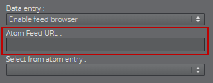
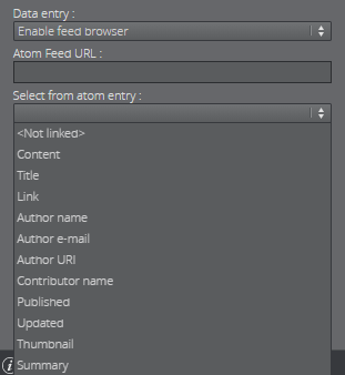
Specify the atom feed for the field and a selection of its subfields:
Select from Atom Entry
Note: The options available for a given field depend on the type of the field (the atom namespace prefix represents the http://www.w3.org/2005/Atom namespace, and the media namespace represents the http://search.yahoo.com/mrss/ namespace).
-
<Not linked>: not linked to the atom feed, and must be filled in manually.
-
Content: linked to the content of the atom:content element in the atom entry.
-
Title: linked to the content of the atom:title element in the atom entry.
-
Link: linked to the href attribute of the atom:link element in the atom entry. Which link entry to pick depends on the Link-rel in atom entry property and the type of the field - the first link with a correct rel attribute and a type that matches the type of the field is chosen.
-
Entry: linked to the atom entry itself.
-
Author name: linked to the content of the atom:name element inside the relevant atom:author element. If the entry itself contains an atom:author element, that is used. Otherwise the atom:author element of the feed is used.
-
Author e-mail: linked to the content of the atom:email element inside the relevant atom:author element. If the entry itself contains an atom:author element, that is used. Otherwise the atom:author element of the feed is used.
-
Author URI: linked to the content of the atom:uri element inside the relevant atom:author element. If the entry itself contains an atom:author element, that is used. Otherwise the atom:author element of the feed is used.
-
Contributor name: linked to the content of the atom:name element inside the atom:contributor element in the atom entry.
-
Published: linked to the content of the atom:published element in the atom entry.
-
Updated: linked to the content of the atom:updated element in the atom entry.
-
Thumbnail: linked to the url attribute of the media:thumbnail element in the atom entry.
-
Summary: linked to the content of the atom:summary element in the atom entry.
-
Link-rel in Atom Entry: only available if Link is selected in the Select from atom entry property; it specifies the rel attribute of the link element in the atom entry.
Note: A linked field may also be filled in manually if it's not hidden or read-only.