Viz Arc lets you create custom templates for both Viz Engine scenes and Unreal Engine levels. The templates are fully customizable and a script can be used for even more flexibility, including data integration and custom logic.
Note: Before creating a new template, you must ensure that Graphic Hub has the required Add-Ons to store the templates, see Configuring Graphic Hub.
Creating a New Template
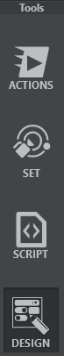
Under the Tools section, select DESIGN.
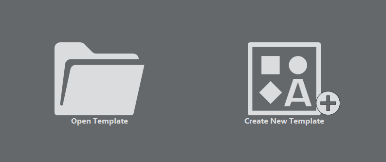
Next, click Create New Template.
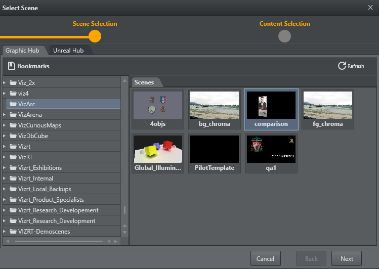
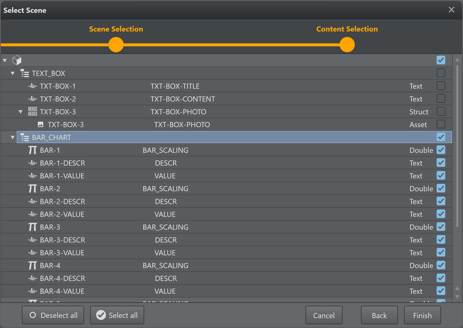
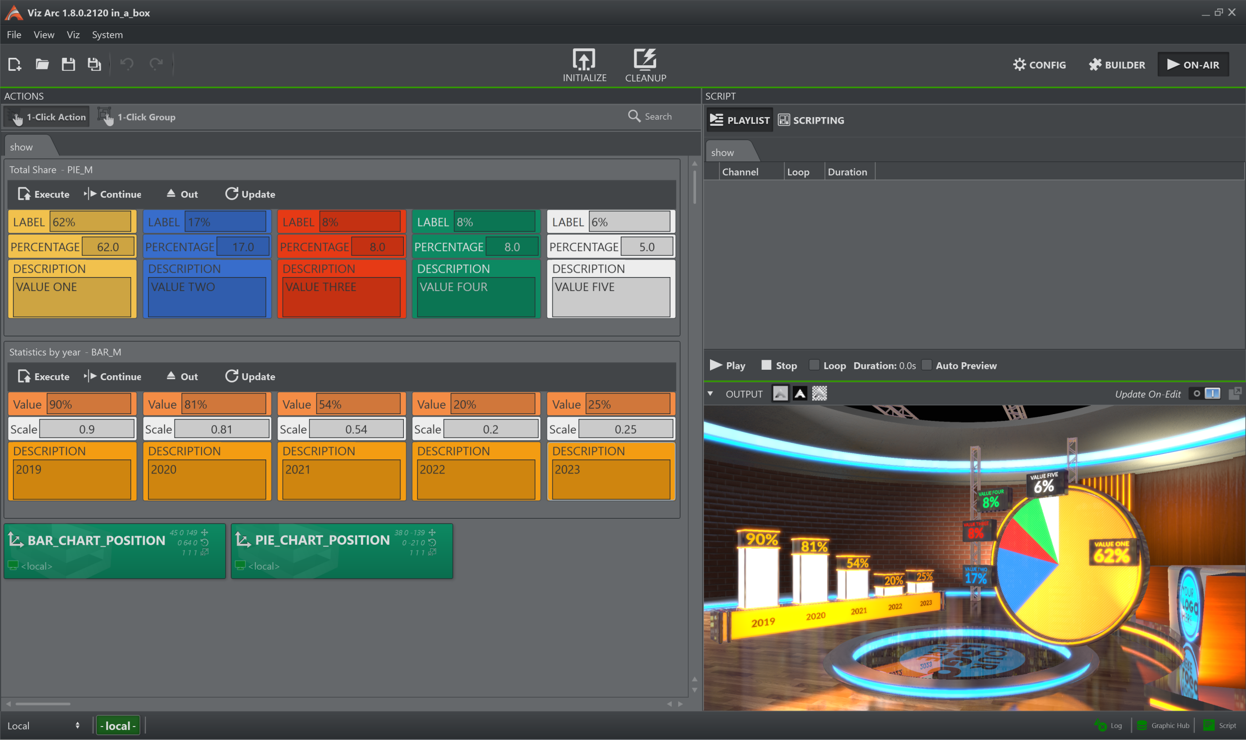
A browser window appears where you can select either a Viz or an Unreal scene:
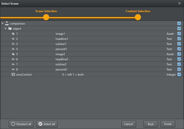
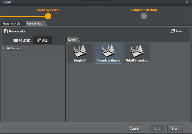
Click Next to view Control Objects found within the scene. Select the Control Objects for which a default UI is to be created:
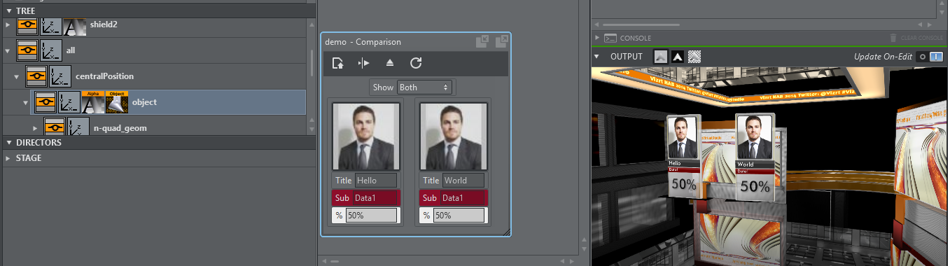
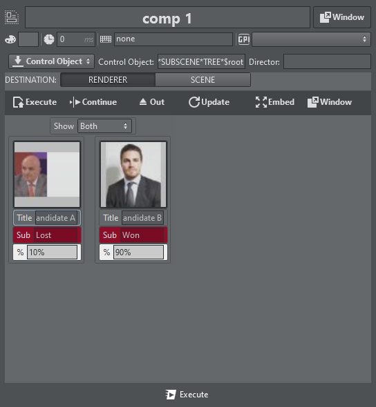
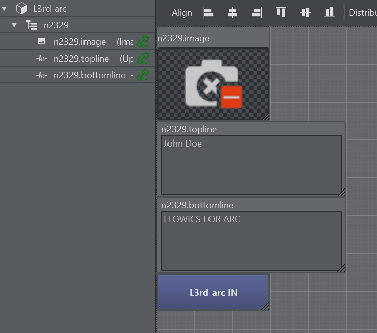
Click Finish. A default UI based on the selected Control Objects has now been created:
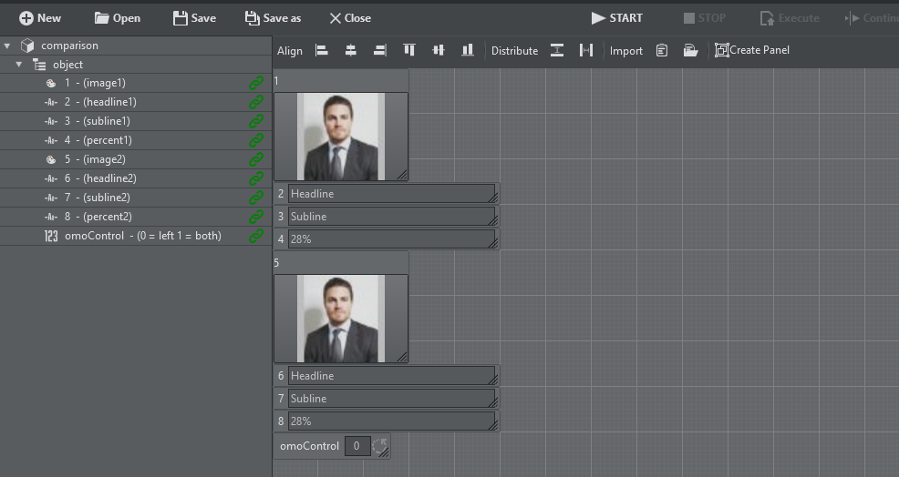
The left hand side contains a list of the Control Objects' IDs along with their description. A green link icon indicates whether the Control Object is linked to a UI element.
A property panel on the right shows editable properties of the selected UI element, or, in case of multi-selection, the properties that are common to the selection. A sample of a text parameter property:
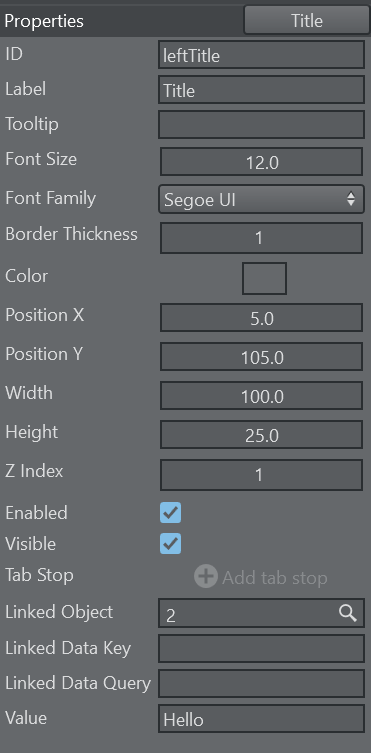
ID: The unique internal ID of the parameter that can be used in the script code to reference the parameter.
Label: The label of the parameter.
ToolTip: An optional ToolTip.
Font Size: The size of the font used in the textual parts of the component.
Font Family: The font used in the textual parts of the component.
Border Thickness: The border thickness of the parameter.
Color: The background color of the parameter.
Position X: The horizontal pixel position of the upper left corner of the parameter.
Position Y: The vertical pixel position of the upper left corner of the parameter.
Width: The width of the parameter.
Height: The height of the parameter.
Z Index: The z sort index of the parameter. In case of overlap with other parameters this value can determine whether the parameter is in front or behind the overlapping component.
Enabled: Whether the parameter is usable for user interaction.
Visible: Whether the parameter is visible to the user.
Tab Stop: The order of the tab-stop.
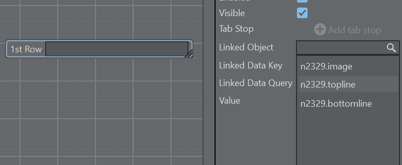
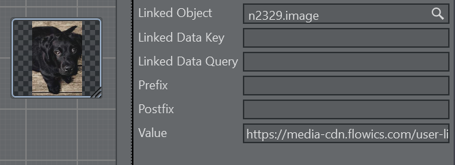
Linked Object: In case the parameter is linked to a ControlObject ID or a Blueprint variable.
Linked Data Key: The name of the DataMap key (see DataMap Linking).
Linked Data Query: The query for the DataMap value (see DataMap Linking). Can be empty for simple data mapping.
Value: The actual value of the parameter.
Using a Template
Templates are available in the action panel.
The list of templates can be refreshed by right-clicking on the template list canvas and selecting Refresh from the context menu.
To create an instance of a template, drag and drop it to the action canvas.
The template action can be opened in the same way as all other actions in a popup window. It can detached as a window that always stays on top, or embedded into the action canvas using the Embed or Window buttons 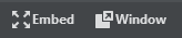 .
.
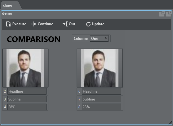
Template action as an embedded window is shown above. The embedded window can be resized by percentage or by using the resize grip in the bottom right corner of the action.
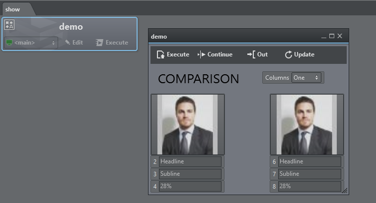
Template action as a detached window is shown above.
You can zoom in and out of each template action using the shortcuts CTRL + to increase size, CTRL - to reduce size, and CTRL + 0 to restore the original size.
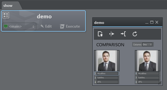
A zoomed out version of a template action window is shown above.
Global Template Properties
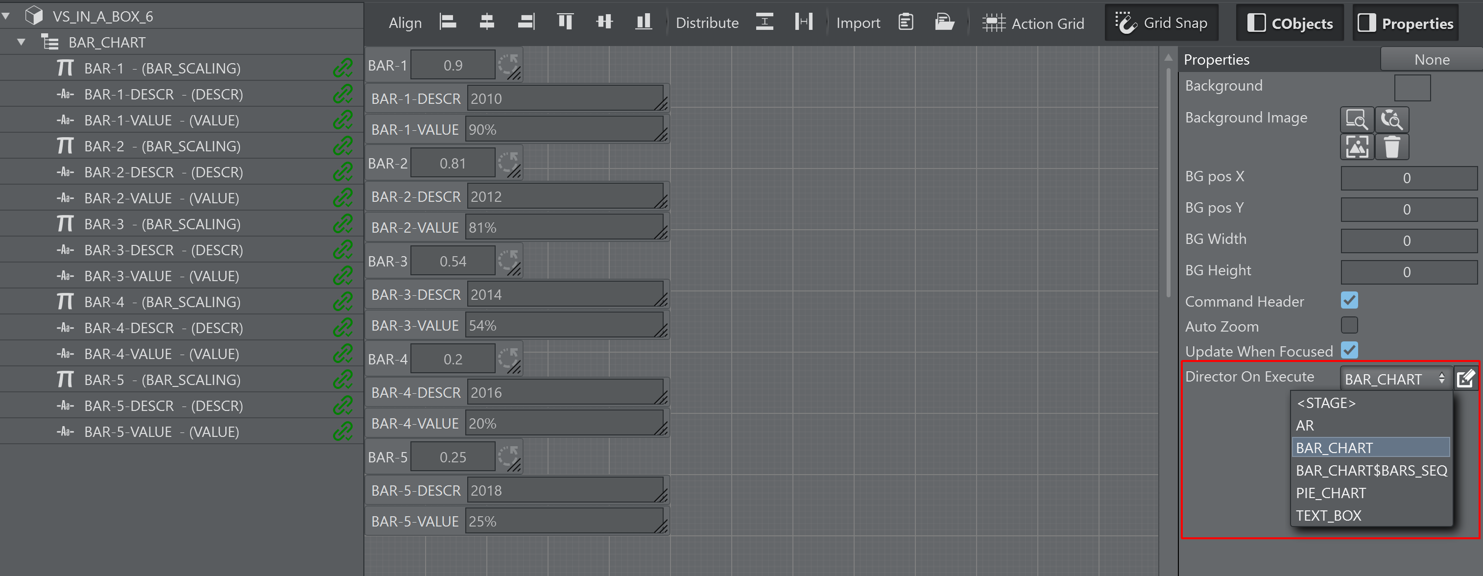
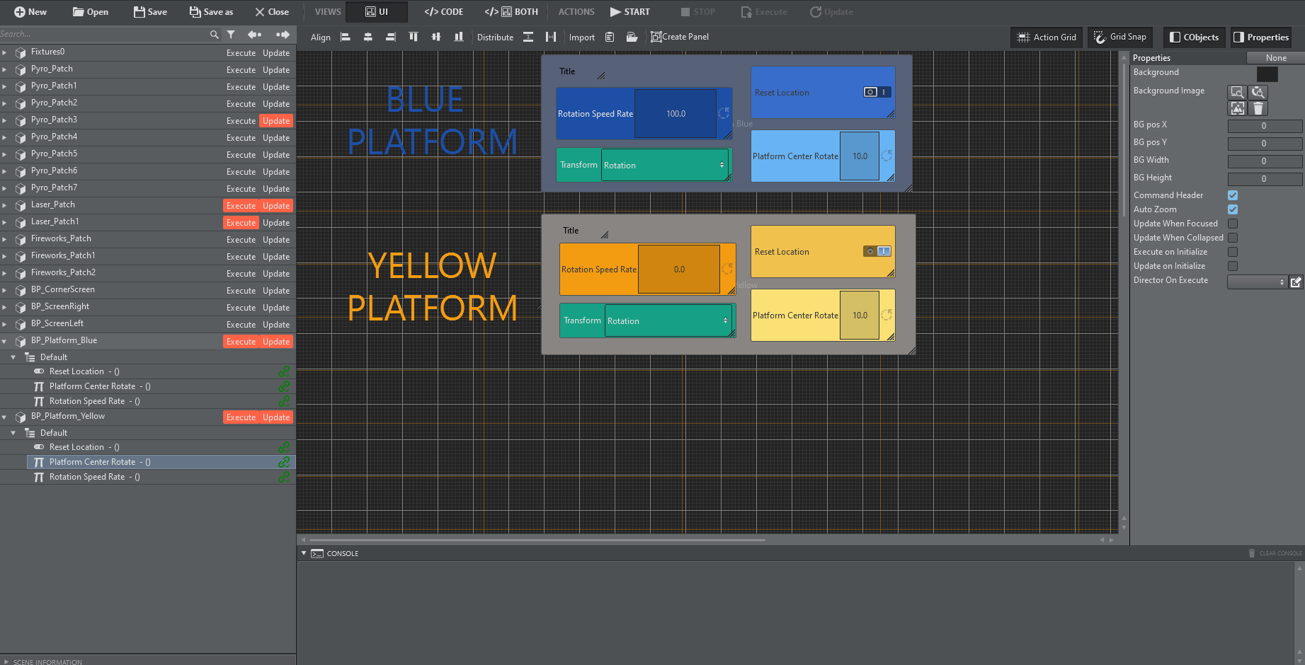
When creating or modifying a template and when in the UI editing mode, click on the background canvas to access a template's global properties:
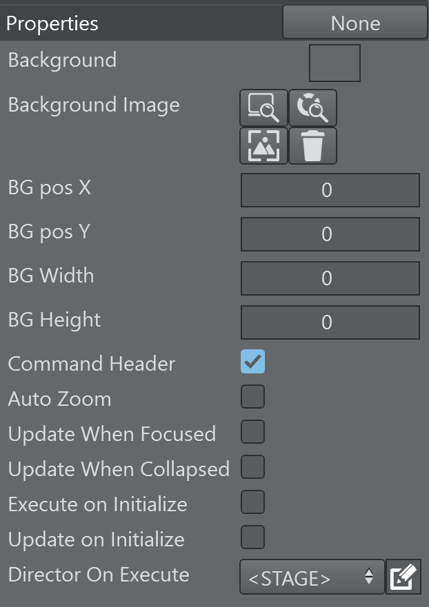
Background: Sets a default background color. When dragging the template onto the action canvas, the action color is the background color.
Background Image: Lets you choose a background image for the template either from a local file system, the GH or the Media Service. The snap button grabs the current frame of the editing Engine.
BG pos X: The horizontal pixel position of the background image.
BG pos Y: The vertical pixel position of the background image.
BG Width: The pixel width of the background image.
BG Height: The pixel height of the background image.
Command Header: Whether the template displays the default command header (Execute, Continue, Update, Out).
Update When Focused: When enabled, the template receives callbacks only when the template is selected, has focus, and is opened in either embedded or window mode. Relevant callbacks are: OnTimer, OnStreamDeckKey, OnDataMapValueChanged. When disabled, the template receives those callbacks when instantiated on the action canvas in any form (embedded, windowed or closed and without being explicitly selected).
Update When Collapsed: When enabled, the template can receive callbacks when the template is collapsed as action button. Relevant callbacks are: OnTimer, OnStreamDeckKey, OnDataMapValueChanged. When used in combination with the flag Update When Focused unchecked, the template always receives the relevant callbacks, when not selected and collapsed to a standard action button.
Execute on Initialize: Executes the template when the global Initialize button is triggered.
Update on Initialize: Updates the template when the global initialize button is triggered.
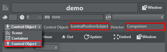
Director On Execute: This dropdown menu contains the list of directors of the scene. Select a director that should be triggered when executing and continuing the template. By default the entire Stage is animated when <STAGE> is selected.
Template Controls

Execute
A template action can be triggered using the Execute button above the template or through the system keyboard shortcut Execute Selection. When the action is collapsed, the regular Execute button on the action does the triggering. When executing, the scene that is associated with the template is loaded, the Control Objects are being updated and the stage is being played. In case an engine of the associated channel has a Concept configured, the scene in that concept is loaded.
Continue
The Continue button or the Continue Selection keyboard shortcut sends a continue command to the scene stage. When the action is collapsed, the Execute button executes a Continue when clicked with the right mouse button.
Out
The Out button or the Out Selection keyboard shortcut removes the scene associated to the template from the renderer, thereby causing a hard out.
Update
The Update button or the Update Selection keyboard shortcut sends the currently set Control Objects to the renderer and update the values accordingly. This can be useful for updating live data while a scene is on-air.
Info: The system Execute Selection, Continue Selection, Out Selection and Update Selection shortcuts only work when a single action is selected.
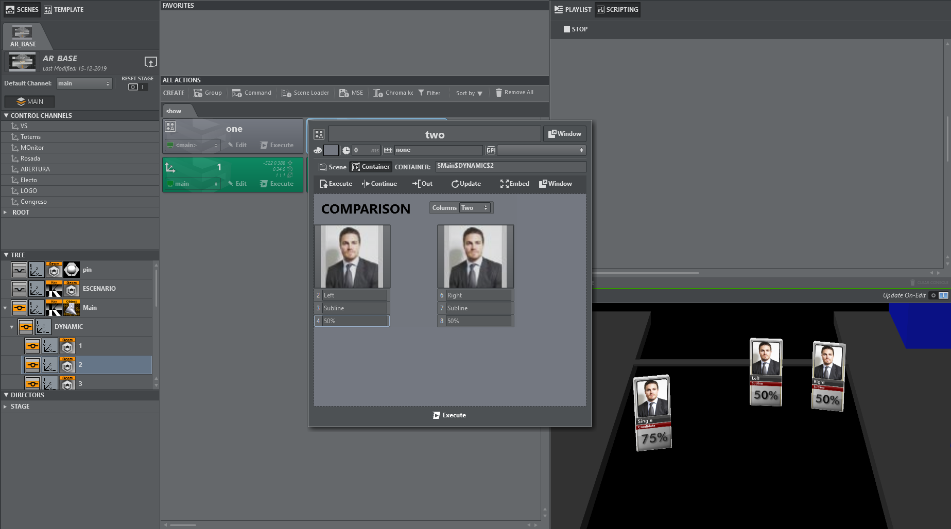
Adding Templates to a Master Scene
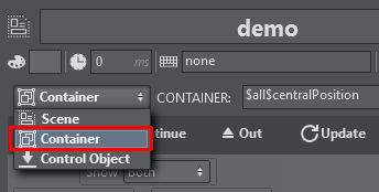
By default, a template action is triggering a stand-alone scene and is thus useful for simple lower third graphics, tables etc. When editing the template action, it's possible to toggle the destination of the template's action to a container path of another scene.
The container path can be entered manually or can be obtained from the scene tree by right clicking the desired container and selecting Copy full path to clipboard.
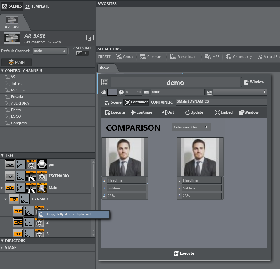
Executing those actions results in the objectified object being loaded into the destination container path and the respective Control Objects being updated.
Another way to insert template scenes into a master scene is the following:
Create your template based on a separate scene.
Insert manually the objectified geometry into you master scene.
Split the merged geometry.
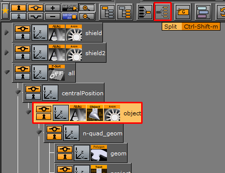
You'll obtain a container containing your top ControlObject as in the stand-alone scene.
Locate the director and re-arrange and rename in the Viz Artist stage, if necessary.
Save the scene and reload it in Viz Arc.
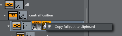
Copy the full path of the container containing the Control Object.
In the template select Control Object, paste the container path to Control Object and the path to its Director to Director.
You'll be able to operate your template with execute/continue, while the scene is embedded in the AR/VR master scene.
In case a scene is loaded in the scene tree as a SUBSCENE, manually append the string *SUBSCENE*TREE*$PathToControlObject.
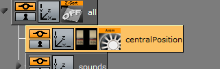
As an example, consider a scene with a container $scene1.
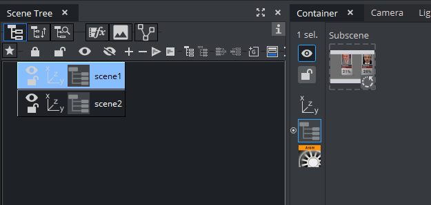
This container contains a SUBSCENE, on the subscene another scene is loaded that has a ControlObject on the $root container.
A template can now be used to control the controls of the subscene using the path $scene1*SUBSCENE*TREE*$root in the Control Object input field.
Using Templates on a Scene Containing Multiple Top Level Control Objects
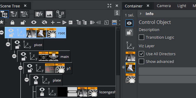
Within a large AR scene, you might want to create subtrees separating different graphics elements. For example, a subtree containing a bar chart and another subtree containing a pie chart graphics.
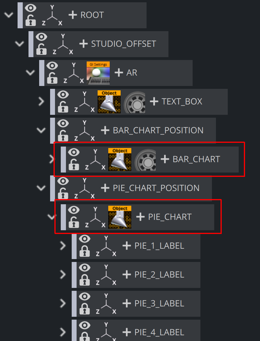
When using this kind of tree structure having Control Objects spread around the scene as sibling nodes, it is possible to directly create templates for each individual top level Control Object.
While creating a new template by selecting the scene from the Graphic Hub, you'll be able to select either one of the top level controls. You cannot control multiple top level control objects from within a single template.
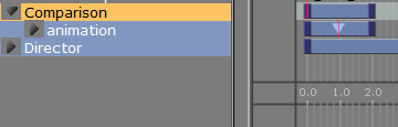
Once a Control Object is selected for the template, choose which director should be used when executing the Execute and Continue buttons of the template. The selection can be found on the template background property when clicking any empty space on the template canvas. The subscene director has to be built in such a way that there is a stop point when the graphics are fully animated in and that a continue command animates the graphics out again.
Once the templates are finished they can be uses as embedded templates on the action canvas. The operator can trigger the different elements individually.
Unreal Templates
Creating a New Unreal Template
The process of creating an Unreal template is almost the same as that for creating Viz templates, with a few slight differences.
Creating an Unreal Template
Go to the DESIGN section.
Click Create new template to open the wizard.
Select the Unreal Hub tab and select a level.
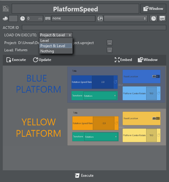
Upon selecting a level and clicking Next, the level is set on the configured Unreal editing Engine and all of the blueprint actors and the level blueprint are parsed and displayed on the following screen (as shown below).
The list displays all the blueprint actors found and a list of their categories and exposed objects. You can then select which are to be created when finalizing the template creation.
Unreal-specific Features
The Unreal template in the screenshot above contains the following Unreal-specific features:
Template Controls
Only Execute and Update are available for Unreal templates.
Unreal Function Integration
On the left side of the parameter canvas, there is a tree-view containing all the existent blueprint actors. Clicking the Execute or Update button triggers a popup, allowing you to choose whether the template should call a function and, if so, which one to call (as defined in the Unreal blueprint).
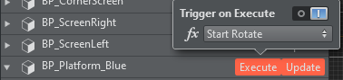
Note: The list of blueprint functions (function drop-down) only displays those functions that have no input parameters.
Using a Template
You can access all saved templates on the action panel. Unreal templates can be identified by the UE4 icon that precedes the template name.
Similar to Viz templates, the edit popup for an Unreal template contains settings for loading the level or project on execute.
Flowics
Preparing Flowics Graphics for Use in Viz Arc
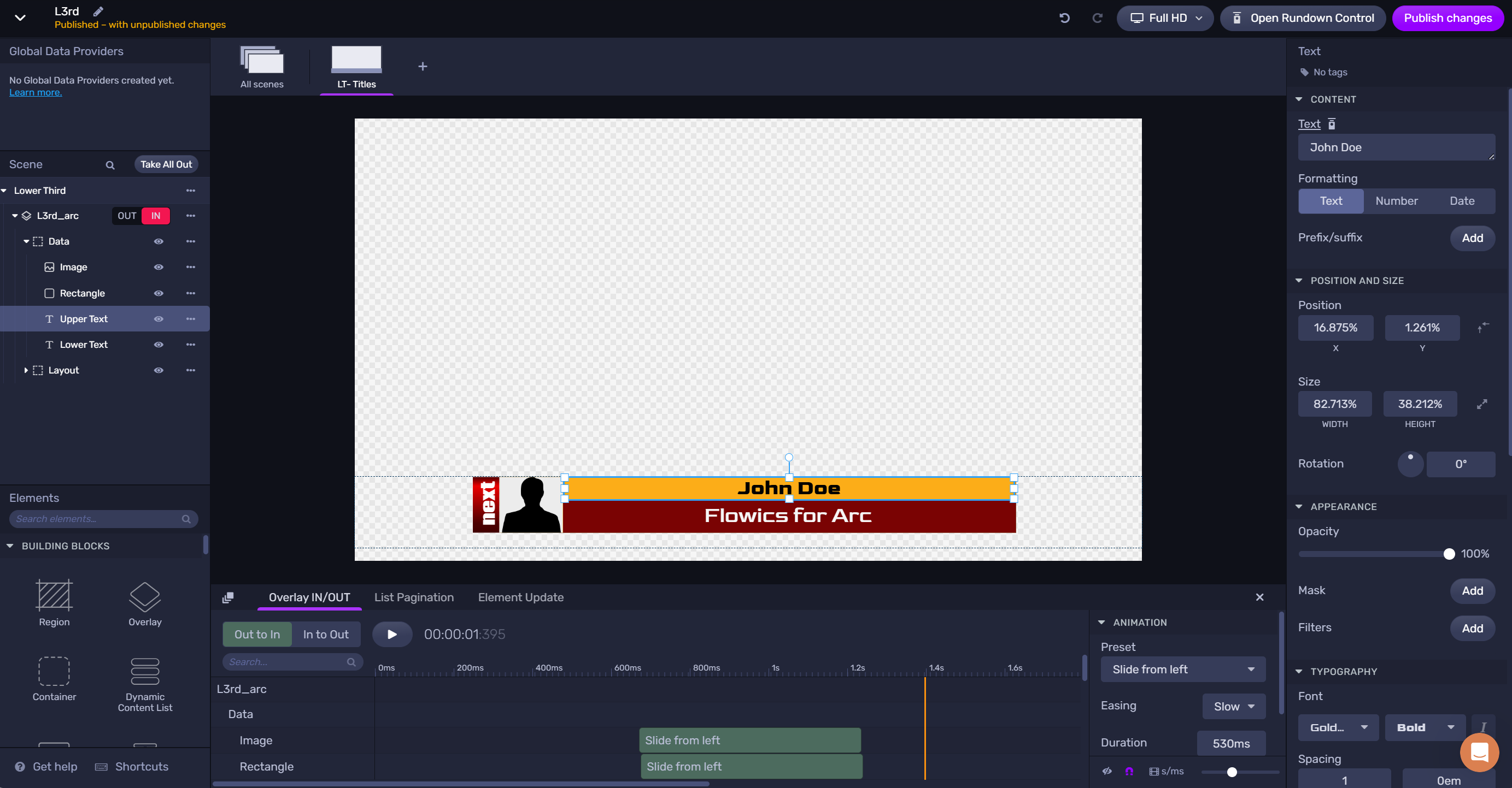
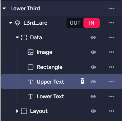
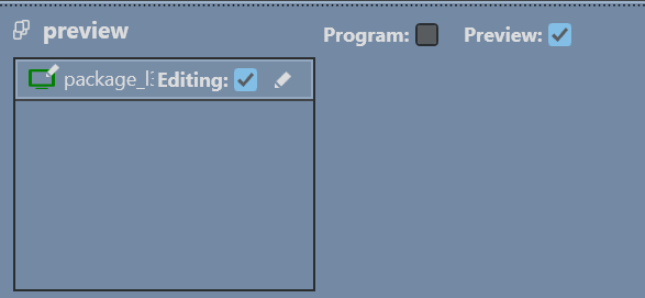
As a first step, the Flowics graphics package needs to be prepared for being controlled by Viz Arc. The steps are the same as they are for controlling the graphics Flowics Remote Control or Rundown Control. The fields that need to be exposed, in this sample the two text lines of the lower third graphics and the image:
Select the graphics element to be exposed.
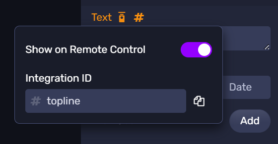
Enable the Show on Remote Control checkbox and add a Integration ID.
Repeat those steps for all elements that need to be controlled. When done, make sure the modifications are Published 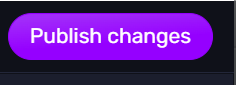 .
.
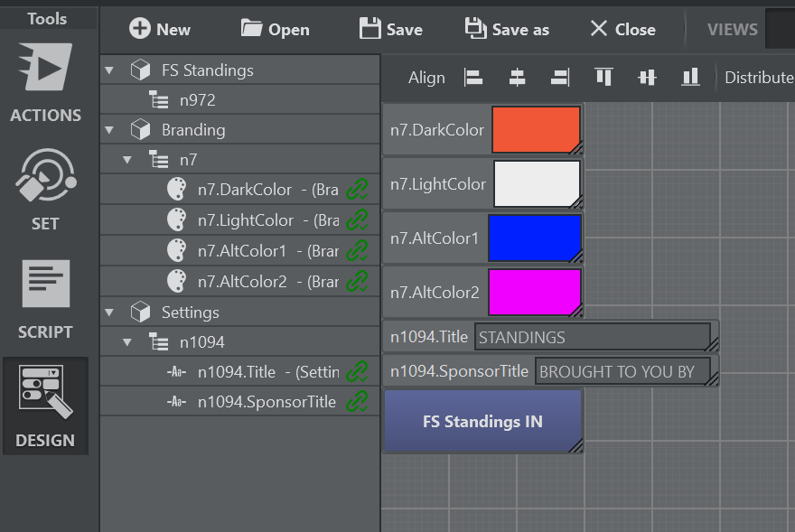
Creating a New Flowics Template
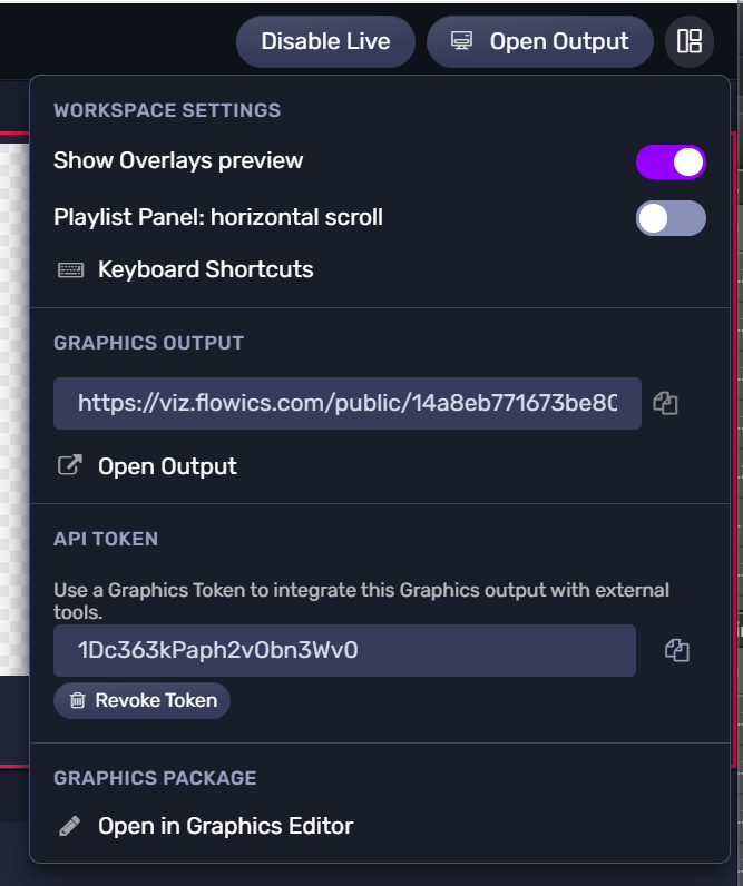
Make sure the editing engine in your profile is configured to use the graphics token of your graphics package.
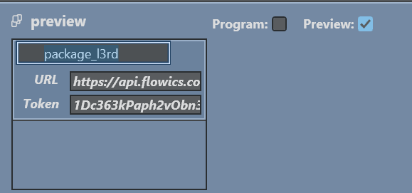
It must match the API Token specified in Flowics:
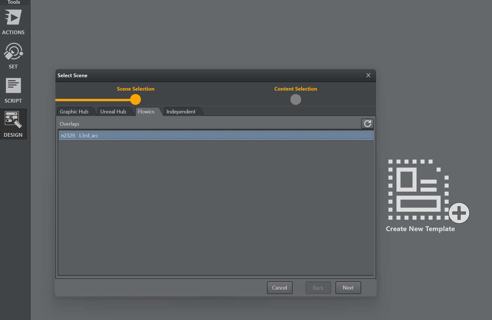
Next, go to the Viz Arc Design tab and create a new template. Select the Flowics tab an select the overlay to be used.
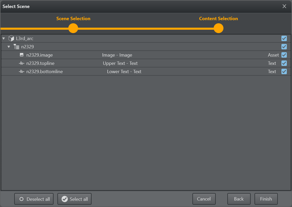
Click next and select the Integration ID’s of the overlay to be generated into an initial template UI.
You can also create new UI parameters and link the Integration ID’s afterwards. The id’s are available the drop down menu as Linked Object property.
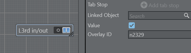
The toggle button responsible to animate the overlay in and out can be customized, the Overlay ID can be specified as well as the on/off colors and labels.
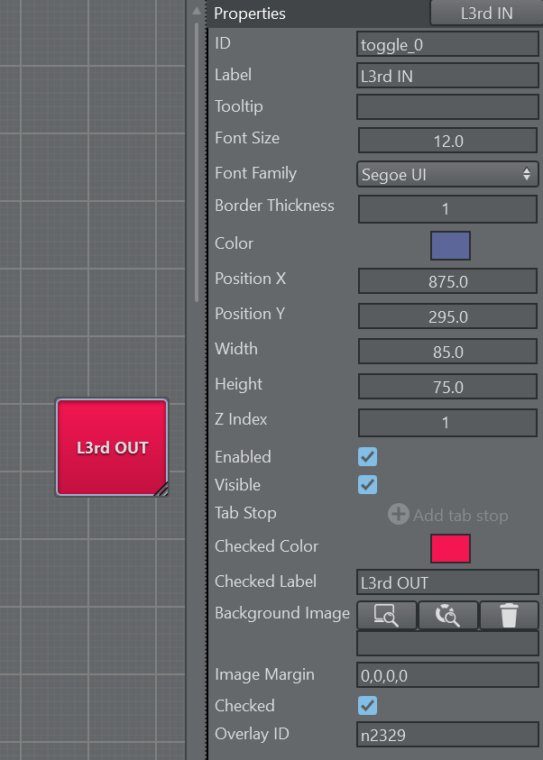
The overlay can be also controlled by a bool parameter, just enter the Flowics overlay id int the Overlay ID property.
The image Integration ID’s can be only assigned manually or through scripting.
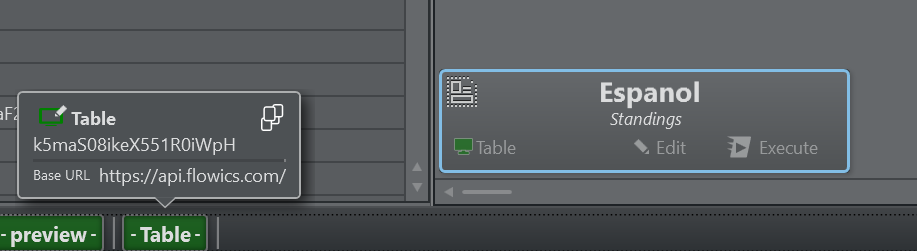
The asset URL can be copied from the Flowics asset library using the Copy URL button of the asset
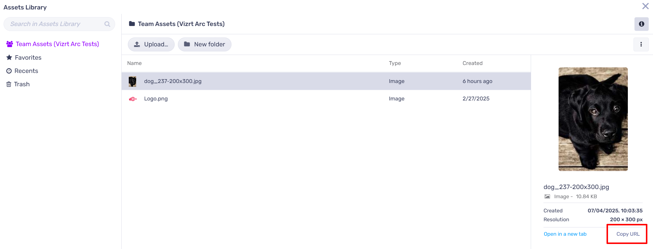
The Flowics Asset library cannot be browsed from Viz Arc at the moment. Please also note that assets from the Graphic Hub or the local file system will not work. The assets need to come from the library or any other public http endpoint.
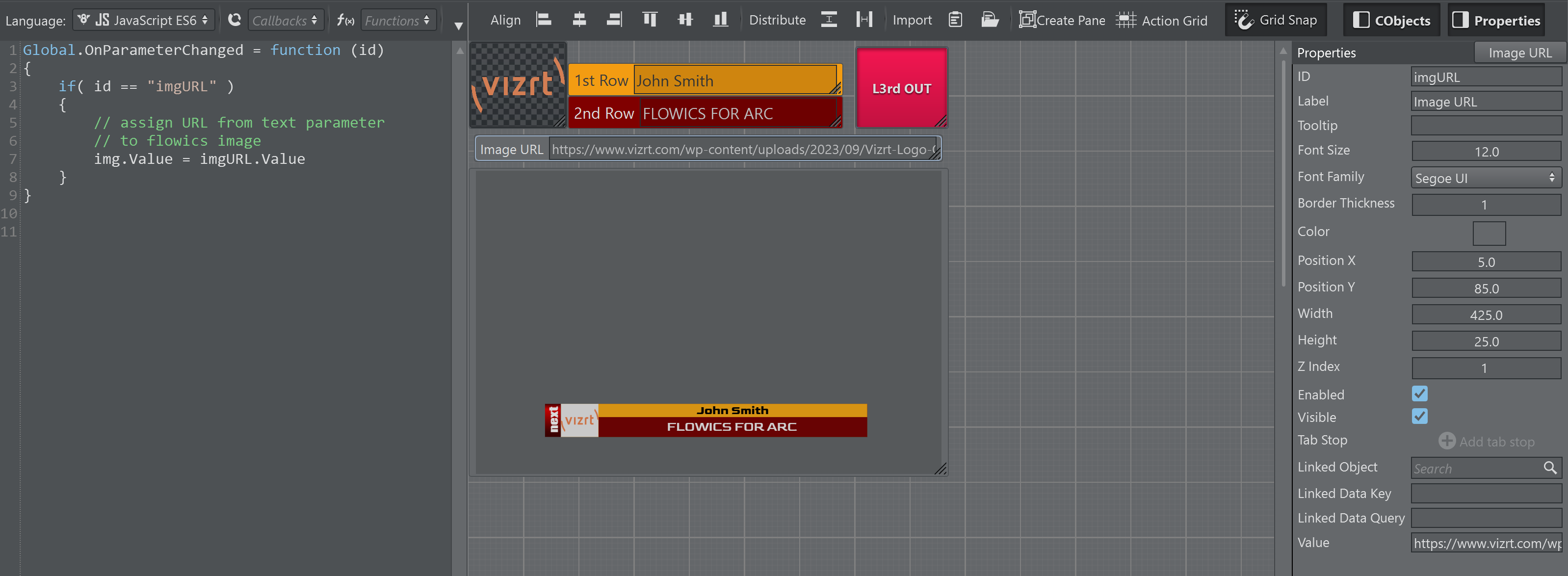
A simple script demonstrating how an image URL can be assigned to an asset parameter programmatically.
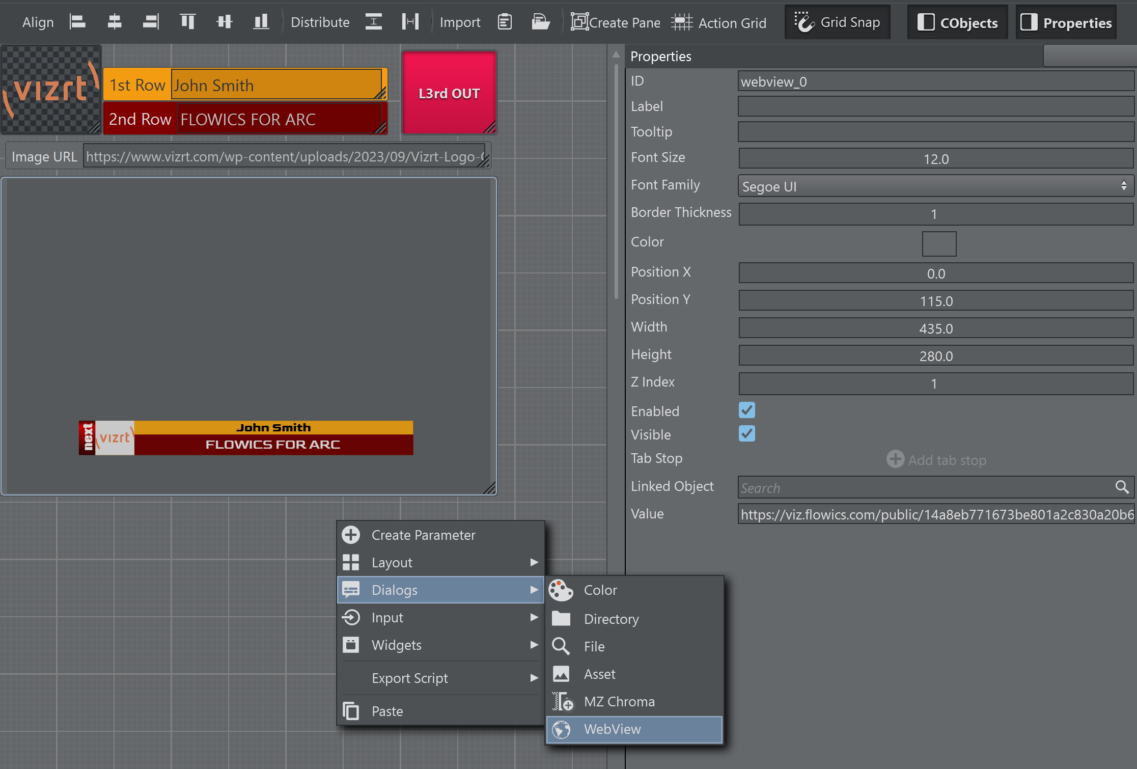
A WebView parameter can be added with the respective output of the Flowics output.
Execution and Update Logic
When a Flowics template gets executed through the Execute button or through shortcuts, the Integration ID’s mapped in the template UI and the toggles mapped in the UI are updated on the Flowics output.
When the template gets updated through the Update button or it’s respective shortcut, only the Integration ID’s are updated on the Flowics output.
Data can be updated selectively using the UdpateTemplate scrpting method. When the function is called without parameters, all Integration ID’s mapped in the template UI are updated on the output. When a space separated list of Integration ID’s is used, only those ID’s are updated on the output.
Extending the sample above, the output is updated as soon as the text is validated on the template UI (though lost focus or on enter pressed in the text parameter).
Global.OnParameterChanged = function (id){ if( id == "imgURL" ) { // assign URL from text parameter // to flowics image img.Value = imgURL.Value } else if( id == "text_2nd" || id == "text_1st") { // text_2nd and text_1st are the internal Viz Arc script id's of the text parameter's // linked to the Floics Integrtion ID's n2329.bottomline and n2329.topline // only update the 1st and 2nd row text UpdateTemplate("n2329.bottomline n2329.topline") }}Global Data Provider - Custom Data
The Global Data Provider in Flowics is a powerful tool to control graphic settings throughout the GFX package. A setting (e.g. a text string or a color) can be linked multiple times throughout one or multiple overlays.
In particular the Custom Data provider can be used to expose controls to Viz Arc templates.
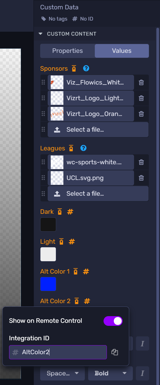
The respective control needs to have an Integration ID assigned to be exposed to Viz Arc. Currently only Text, Image and Color properties are supported.
Create a new template and select the Overlay(s)
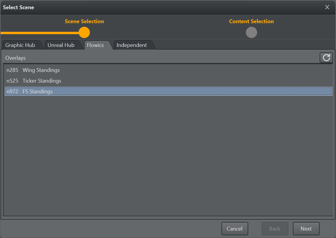
In the next step of the template wizard the Global Data Providers show up where the single elements can be selected/deselected for automatic UI generation.
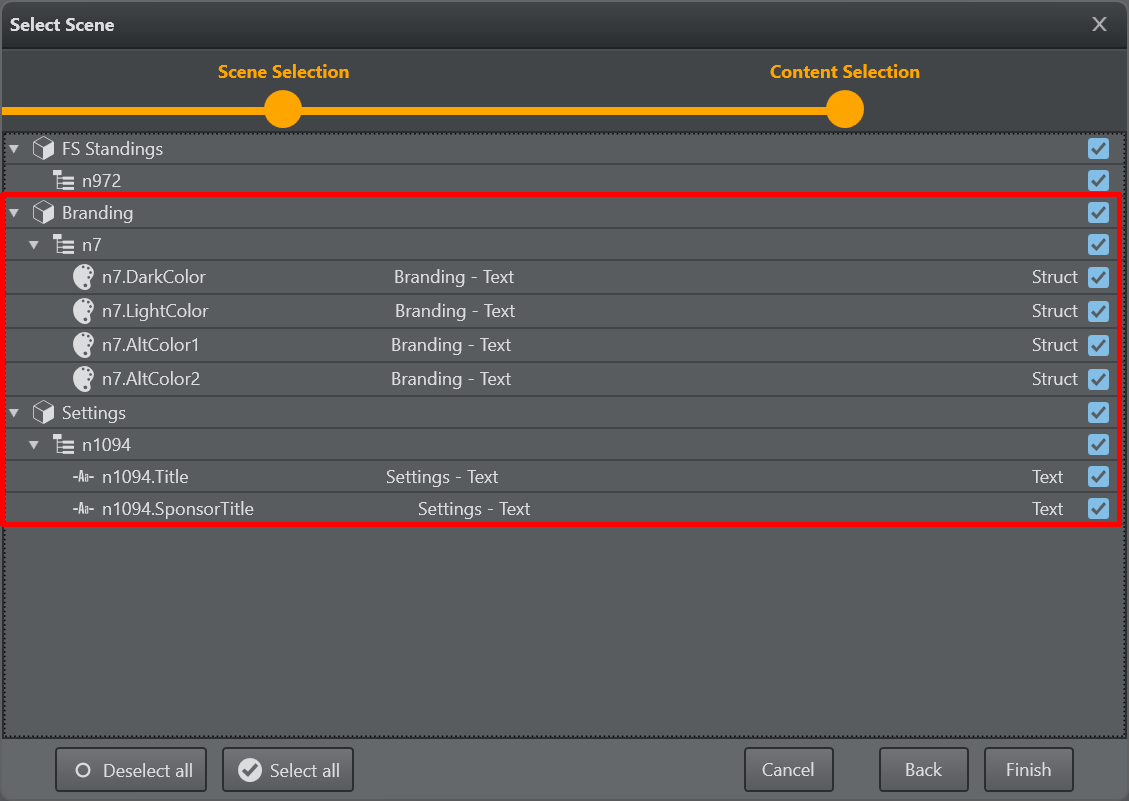
The UI generated might then look like this:
The logic of Execute and Update
Once the template is finished it is ready to be used.
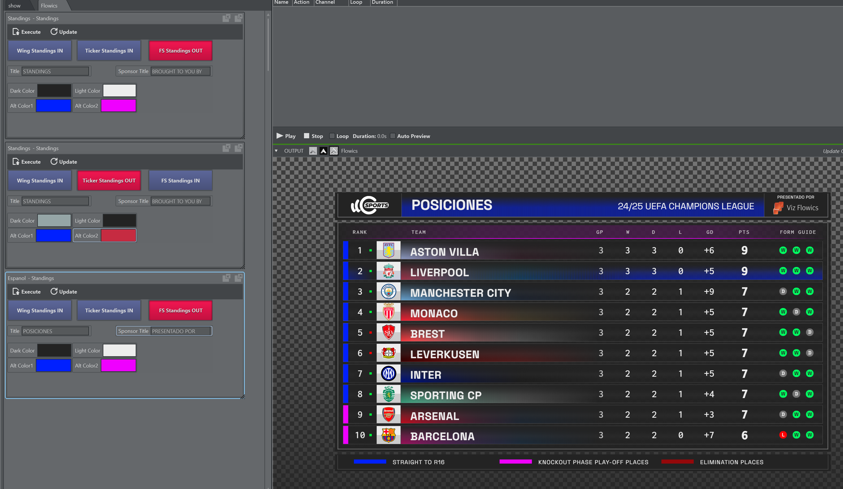
When a template is Executed all the linked data in the template is updated on the Flowics graphics and all the toggle buttons present in the template are going to be matched in the graphics. Overlays are animated in or out according to their status in the template UI.
When a template is just Updated, only the linked data items are updated on the Flowics graphics.
Make sure the templates are linked to the correct output channel/engine matching the correct Flowics API token.
Executing Custom Commands
It is possible to send custom commands to Flowics engines. They need to be wrapped in a JSON structure, as shown below, and sent to the engine as a stringified JSON.
{ "command" : string, "method" : string, "postfix" : string, "content" : string, "doArrayWrap" : bool}command: Needs to be “custom”.
method: Can be PATCH, GET, PUT, POST, DELETE.
postfix: The postfix to be added to the URL.
content: The JSON content to be sent as a payload to Flowics.
doWrap: Use true to wrap the content into JSON array brackets ‘[' and ']’.
Info: The Flowics API documentation can be found here.
The clock as it appears in the Flowics remote control:
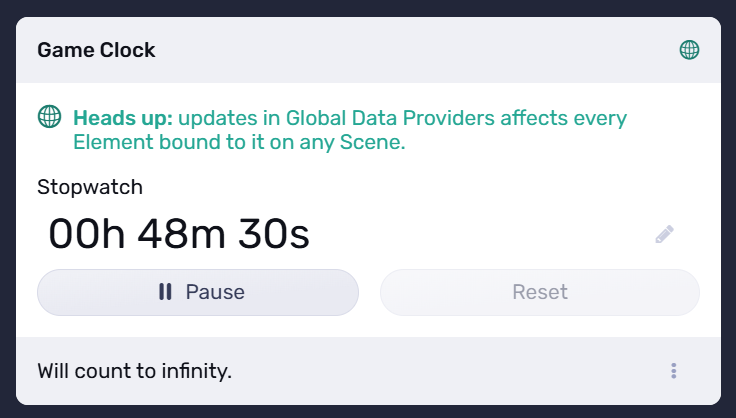
The following example shows a convenience function for a Viz Arc Javascript, that sets and starts a soccer clock (for example, it can be triggered when a match starts at 00:00 or the second half at 45:00).
function SetClockAndPlay(clockVal){ var flowicsCommand = new Object() flowicsCommand.command = 'custom' flowicsCommand.method = 'PATCH' flowicsCommand.postfix = '/control/global-data-providers' flowicsCommand.content = "{\"id\":\"n1818\",\"controls\":{\"stopwatch\":{\"value\":{\"startFrom\":\"" + clockVal +"\",\"timeReference\":\"" + Date.now() + "\",\"current\":\"" + clockVal + "\",\"state\":\"play\"}}}}" flowicsCommand.doArrayWrap = true GetSelectedChannel().SendSingleCmd(JSON.stringify(flowicsCommand)) Console.WriteLine("SetClockAndPlay " + flowicsCommand.content)}The function above can be invoked as:
SetClockPlay("00:45:00")The content as a JSON:
{ "id":"n1818", "controls":{ "stopwatch":{ "value":{ "startFrom":"00:45:00", "timeReference":"1753173655377", "current":"00:45:00", "state":"play" } } }}