
Viz Pilot User Guide
Version 7.2 | Published May 08, 2017 ©
Standard Components
Standard components are the most commonly used components. This section contains the following topics:
-
Unicode Label Component
-
Unicode Edit Component
-
Unicode Memo Component
-
Image Component
-
World Maps Editor Component
-
Panel Component
-
Unicode Button Component
-
Unicode CheckBox Component
-
Unicode Radio Button Component
-
Unicode ComboBox Component
-
Unicode ListBox Component
-
Unicode GroupBox Component
-
Static Image Component
-
Page Control Component
-
Template Information Component
-
Person Information Component
-
Feed Linker Component
Unicode Label Component

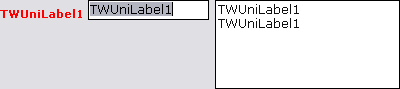
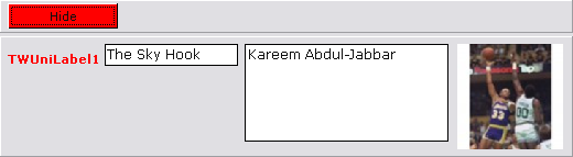
Label adds a basic text label to the template.
Notable Properties
-
Caption: Changes the label text.
-
Font: Sets the font type and size.
Script Example

TWUniLabel1.Font.Color = clRedUnicode Edit Component

Edit adds a basic text field editor to the template.
Notable Properties
-
EnableSpellCheck: Enables spell checking for the text field.
-
Name: Sets the name of the text field.
-
UTF8Text: Sets the text in the text field.
Script Example
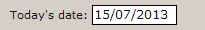
The text field can be set as follows: TWUniEdit1.UTF8Text = Date
or, alternatively, using: SetUnicodeValue TTWUniEdit1, Date
where SetUnicodeValue takes the unicode input parameter, UTF8-encodes it and sets the .UTF8Text property.
GetUnicodeValuereads the .UTF8Text property from components, UTF8-decodes it and returns, for example:
Sub TWUniButton1Click(Sender)
MsgBox GetUnicodeValue(TWUniEdit1)
End sub
Another example using the Unicode Edit field is described in this Script Example (Image with Name, Unicode Edit and Template Info).
To enable spell checking in Unicode Edit and Unicode Memo fields
-
Use the Wizard to create a new template.
-
Add a Unicode Edit Component or Unicode Memo Component field to the template.
-
Check the EnableSpellCheck property for each field that requires spell checking.
-
Save the template.
Note: The actual spell checking will only occur when the template is saved as a data element in the Newsroom System or Director.
Unicode Memo Component

Memo is a wrapper for a multiline edit control. Multiline edit boxes allow the user to enter more than one line of text. They are appropriate for representing lengthy information.
Notable Properties
-
EnableSpellCheck: Enables spell checking for the text field.
-
Name: Sets the name of the multiline text field.
-
UTF8Text: Sets the text in the text field.
-
WordWrap: Wraps a section of words, adding line breaks (this property is listed in the All tab). Refer to the example below for more information.
Script Example
TWUniLabel1.Font.Color = clRed TWUniEdit1.Text = TWUniLabel1.UTF8Text TWUniMemo1.UTF8Text = TWUniLabel1.UTF8Text & vbCrLf & TWUniLabel1.UTF8TextNote: The code snippet vbCrLf__adds a line break after the first text element.
When enabling the WordWrap property, the width of the template’s text box decides where the line breaks in the graphics will be. Hence, the output on the renderer might not be as intended. If the template’s text box is narrower than what the scene allows, the output will have line breaks according to the text box, and not according to the scene design. To solve this, either use the Wrap Fixed Unicode Memo component without WordWrap, or add a script that can remove all line breaks. The example below is most useful for scenes with only one text paragraph.
temp1 = TWUniMemo1.UTF8Text temp1 = replace(temp1, chr(10), "") temp1 = replace(temp1, chr(13), "") TWUniMemo1.UTF8Text = temp1Tip: Use the Wrap Fixed Unicode Memo Component component to avoid scripting.
Image Component

The TTWImage component (also known as Image with Name And Title Linking Component) has a several uses. It can of course be used for setting images in Viz Engine scenes, but it can also be configured to control backgrounds, objects and materials. In addition it has a special feature making it possible to add a video instead of an image.
Notable Properties
-
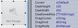
AllowCropAspectOverride: Enables users to select a different aspect ratio than the one given by the DestHeight and DestWidth properties, when using Crop Service. Default value = False. See Preset Image Size.
-
AlwaysUseCropTool: Enables the user to always use the crop tool by default when an image is added to the template when using the isImageMediaSearch, isFileOpen and isPaste image source options. See To enable the crop tool.
-
ControlObjectName: Links the component to an exposed scene object.
-
DestWidth/DestHeight: Sets the destination width/height of the image, forcing the size of the image used in the scene to be of a specific width/height. For details, see Preset Image Size.
When set to values greater than 0 (zero), it will enable the crop tool. The parameters set a fixed height and width for the crop tool. Using this setting will force the user to use the configured height and width, and the aspect. Meaning, if the selection is greater than then actual height and width parameters, the image will be scaled to fit. -
DisallowedKeywords: Defines the disallowed keywords used when searching for media content. When a user searches and finds an image, they are not allowed to select the image if it contains a keyword that is present in the DisallowedKeywords property.
Note: The DisallowedKeywords property is available for RestVOS and Viz One searches, but not for Object Store searches.
-
EvObjects: Add the path to more object containers to receive the same value as the object defined in ObjectPath. Add the name of containers with “$containername” or the full Viz Engine path. Other objects must have the same keyframe name as the main object.
-
HideObjects: Define other objects that should be hidden when the main image object is hidden.
-
HideOnEmpty: If selected, the object is set to hidden in the scene if no image is loaded.
-
ImageSources: Sets one or multiple image source locations. The default settings are isImage and isImageMediaSearch; however, in most cases the actual control object properties of the scene will decide what components and settings to use.
-
isAdvancedCuriousMap: Allows the user to search and select a map from the Viz World Client using the Classic Edition Editor.
Note: The isAdvancedCuriousMap property is deprecated from Viz Pilot 5.7 and only available for backward compatibility. Use the World Maps Editor Component component instead.
-
isArdome: Allows the user to search and select clips from Viz Ardome.
Note: The isArdome property requires an Ardome connection and setup.
-
isCuriousMap: Allows the user to search and select a map from the Viz World Client using the Lite Edition Editor.
Note: The isCuriousMap property is deprecated from Viz Pilot 5.7 and the Lite Edition editor is not the recommended editor. These features are only available for backward compatibility. Use the World Maps Editor Component component instead.
-
isFileOpen: Allows the user to search and select an image from disk. Note that the image must be available on the Viz Engine using the same shared path.
-
isImage: Allows the user to search the Viz image pool for images through Director’s Viz resource tab. Viz 3.x images are stored on the Viz Graphic Hub while Viz images are stored on its data root.
-
isImageMediaSearch (previously named isDatabase): Allows the user to search and select a still image from the configured service providers (eg. Object Store, Viz One).
-
isMaterial: Allows the user to select a material from the Viz material pool through Director’s Viz resource tab.
-
isObject: Allows the user to select an object from the Viz object pool through Director’s Viz resource tab.
Note: The isObject property requires a local Viz Engine connection.
-
isPaste: Allows the user to paste images from the Windows clipboard by right-clicking the Image icon and selecting Paste... on the context menu. Pasting will open the Crop Image tool. Pasted images should be added to a shared drive accessible to Viz Engine. The crop tool save path is set in Director’s Preferences window under General settings. isPaste does not add images to Object Store, and does not preserve alpha values.
-
isProximity: Allows the user to search and select images or clips from Proximity’s Artbox. Requires the Proximity Artbox asset management system.
-
isRGB: Allows the user to select an image from the Viz RGB pool through Director’s Viz files tab.
Note: Viz Pilot News cannot use isRGB, as this relates to a Director specific function.
-
isScene: Allows the user to select a scene from the Viz scene pool through Director’s Viz resource tab.
-
isVideoMediaSearch (previously named isVideoHub): Allows the user to search and select a video from the configured service providers (eg. Object Store, Viz One). When selected, it allows the user of the template to preview a video item using the Timeline Editor within Director or Viz Pilot News.
-
-
RequiredKeyWords: Defines the required keywords used when searching for media content. See Required Keywords.
-
RequiredKeywordsMode: Sets the options RequireOne or RequireAll. Searches can be performed with information from the RequiredKeyWords field.
Events
-
OnImageInfoChanged: Enables Object Store To add person information to the template. Person information is often registered in Object Store with images of persons in order to easily get the right name of the person in question. See Person Information Component.
-
CreatingMediaOrder: Used with Order Management. This event is raised just before the Order Management window is shown. Its signature looks like:
Sub TWImageInf1CreatingMediaOrder(Sender, CustomParameters, ReservedParameterKeys)-
Sender is set to the image control itself.
-
CustomParameters is a key-value collection where you can add items. For example: CustomParameters.Add("this=1")
-
ReservedParameterKeys is a list containing all the keys that are set by the client for various purposes. It has the following values: keywords, asset_type, destination_width, destination_height, template_name, concept_name, variant_name. If any of these keys is set in CustomParameters then it will be ignored and the value provided by the client will be used instead.
For example:Sub TWImageInf1CreatingMediaOrder(Sender, CustomParameters, ReservedParameterKeys)' Add key value parameter pairCustomParameters.Add"Param1=Value1"' Get index of keyCustomParameters.IndexOfName("Param1") ' returns0(-1ifname is not found)' Get the keyfora given indexCustomParameters.Names(o) ' returns"Param1"' Get the valuefora keyCustomParameters.Values("Param1") ' returns"Value1"End sub
-
Script Example (Image with Name, Unicode Edit and Template Info)
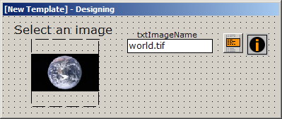
The following example describes how to include the Object Store image name in the data element name.
-
Add a Unicode Edit Component field (name txtImageName) and set it to be invisible.
-
Add a Template Information Component component and add in txtImageName as one of the save name fields.
-
On any of the image components (here named "image") add the following script on the OnFilenameChanged event:
Sub imageFilenameChanged(Sender)txtImageName.UTF8Text =""'Clear the save name before starting\qFirst testifthe returned image is from a Viz One serverifLeft(image.picFilename,8) ="https://"thentxtImageName.UTF8Text ="Viz One Image"else'...it should be an Object Store image\qGet the number of arraysifthe picfilename divided by "\" markNumberOfElements = UBound(Split(image.picFilename, "\"))ifNumberOfElements >0thentxtImageName.UTF8Text = Split(image.picFilename, "\")(NumberOfElements)EndifEndifEnd sub
Preset Image Size
A scene designer can design a scene to use an image of a specific size. By setting a specific width and height the template designer can, in accordance with the scene design, control the aspect. When selecting an image, a crop tool, with a preset aspect ratio, is automatically opened requiring the user to crop the image. Images from Object Store will use the legacy Crop Tool while images fetched with RestVOS from Object Store or Viz One will be cropped using Crop Service.
DestWidth and DestHeight is used as parameters to preset the crop tool and to scale the image further after save, if needed.
If the property AllowCropAspectOverride is true, users can select a different aspect ratio than the one given by the DestHeight and DestWidth properties. This is only supported for images cropped with Crop Services.
Required Keywords
The properties RequiredKeyWords and RequiredKeywordsMode allow the Object Store (VOS), RestVOS or Viz One search to be restricted by keyword in two ways.
RequiredKeywordsMode = RequireOne:
-
The media search will return images containing ONE OR MORE of the keywords specified in the RequiredKeyWords property in the template.
-
When using the template in Viz Pilot News, deselecting some of the keywords is possible, and will narrow down the search. Selecting additional keywords will broaden the search.
RequiredKeywordsMode = RequireAll:
-
The media search will ONLY return images containing ALL of the keywords specified in the RequiredKeyWords property in the template.
-
When using the template in Viz Pilot News, deselecting a required keyword is not possible. Selecting additional keywords will narrow down the search.
Note: The functionality of Viz One and RestVOS allow multiple keywords in the Viz One or RestVOS to map to a single keyword in the interface. If such mappings exist, any RequireAll searches that include such keywords, will be run as RequireOne searches. The result of this is that the user will see more results than is strictly correct. However the user will not be able to use any of the incorrect images as the "OK" button will only be enabled when an image with all the required keywords is selected. To avoid this situation, the keywords in the Viz One or RestVOS should be labeled with unique names.
To enable the crop tool
If the image component uses AlwaysUseCropTool, DestHeight or DestWidth, then the crop tool will be called.
-
In Template Wizard open a template with an image component.
-
Select the image component and set one or both of the following properties:
-
AlwaysUseCropTool: Use the crop tool by default.
-
DestHeight and DestWidth: When set to values greater than 0 (zero), it will enable the crop tool. The parameters set a fixed height and width for the crop tool.
-
-
Select one or several image sources.
-
ImageSources: Valid sources for the crop tool are isImageMediaSearch, isFileOpen and isPaste.
-
-
Save the template.
To add person information to the template
In addition to fetching the person information and adding it to the proper text fields, the following procedure will use the SC_SaveName function to fill the Save dialog box with a save name based on the image’s file name.
-
Start Template Wizard.
-
Create a new template of a scene with an image.
-
Select the image component (TTWImageInf1) that was added to the template.
-
Check the Enable script option in the Object Inspector (CTRL+F12) to enable scripting
-
Select the Events tab, and double-click the OnImageInfoChanged event to add the procedure to the Script Editor.
-
Add the following script:
option explicitdim leveldim savenamefunction SC_SaveNameSC_Savename = savenameend functionSub TTWImageInf1ImageInfoChanged(ImageInfoList, PersonInfoList, KeywordsList)dim iTWUniMemo1.Lines.ClearTWUniMemo2.Lines.ClearTWUniMemo3.Lines.Clearfori =0to ImageInfoList.Count -1TWUniMemo1.Lines.Add(ImageInfoList(i))nextfori =0to PersonInfoList.Count -1TWUniMemo2.Lines.Add(PersonInfoList(i))nextfori =0to KeywordsList.Count -1TWUniMemo3.Lines.Add(KeywordsList(i))nextsavename=ImageInfoList.Values("FileName")End sub -
Save the template and open it in Director or Viz Pilot News to test it.
To use additional fields
-
Add the ImageInfoChanged event to your script:
Sub TTWImageInf1ImageInfoChanged(ImageInfoList, PersonInfoList, KeywordsList)TTWUniEdit1.Text = ImageInfoList.Values("Nationality")End subNote: Nationality refers to an Additional Field added to Object Store.
World Maps Editor Component

World Maps Editor adds a map placeholder to the template.
Note: The World Maps Editor component requires a Viz World Client installation locally and a connection to one or more Viz World Server(s) or a Server Allocator.
The World Maps Editor component has a different workflow from an image component. In the Maps component, additional content is present in the MapXML field in the template saved on the Viz Pilot system, which makes it possible to script standard start points (e.g. for zooms). It also allows the correct Viz World project template to be selected, avoiding the default project error message when the maps editor opens.
Note that in Viz Pilot, it is not possible to fine tune the zoom, latitude, longitude, pan or tilt after making your map selection.
Notable Properties
-
ControlObjectName: Links the component to an exposed scene object.
-
MapXML: Stores the XML that is returned from the Viz World Server once the user has selected a map.
-
VizWorldEditor: Defines the editor to be launched when a map is added to the template.
-
vwClassic_Edition: Classic is the default editor. All the map features are exposed and the user has full control over the map selected.
-
vwSecond_Edition: Second Edition is the next generation map editor. It is more user friendly and will soon have a full set of features.
For more information on how to work with maps, please refer to the Viz World User’s Guide.
-
Panel Component

The Panel component adds a panel that can be used to group a set of components.
Notable Properties
-
Caption: Sets a text string to identify the panel to the user.
-
Name: Sets the name of the panel to use as a reference when scripting.
-
Height and width: Sets the size of the panel.
Script Example (Panel and Unicode Button)
This example shows how a panel can be switched on and off using the Visible property. The color of the buttons change accordingly.

Sub InitForm TWUniLabel1.Font.Color = clRed TWUniButton1.Color = clLime TWUniButton1.Caption = "Show" Panel1.Visible = false End Sub Sub TWUniButton1Click(Sender) if TWUniButton1.Color = clLime then Panel1.Visible = true TWUniButton1.Color = clRed TWUniButton1.Caption = "Hide" else Panel1.Visible = false TWUniButton1.Color = clLime TWUniButton1.Caption = "Show" end if End subTip: See the Speed Button Component, or the Unicode Radio Button Component, for how to create buttons that can work together as a group, and present mutually exclusive choices to the user.
Unicode Button Component

Unicode Button is a push button control, and it introduces several properties to control its behavior in a dialog box setting. Choose button controls to initiate actions.
Notable Properties
-
Name: Specifies the name of the control as referenced in code.
Script Example
An example using Unicode Buttons is described in this Script Example (Panel and Unicode Button).
Unicode CheckBox Component

CheckBox represents a check box that can be on (checked) or off (unchecked).
Notable Properties
-
Checked: Specifies whether the check box is checked.
Script Example
The following script example uses a sub procedure and a function. Components used are; one Unicode button, three Unicode edit fields and two Unicode check boxes.

The Sub procedure TWUniButton1Click calls the function setText using the text string of the TWUniEdit0 edit field as argument.
Sub TWUniButton1Click(Sender) setText(TWUniEdit0.UTF8Text) End sub
The setText function tests to see if the corresponding check boxes are checked. If they are, newText is assigned to the edit fields.
Function setText (newText) If TWUniCheckbox1.Checked Then TWUniEdit1.UTF8Text = newText End If If TWUniCheckbox2.Checked Then TWUniEdit2.UTF8Text = newText End If End FunctionUnicode Radio Button Component

Radio buttons present a set of mutually exclusive options to the user (i.e. only one radio button in a set can be selected at a time). When the user selects a radio button, the previously selected radio button becomes unselected.
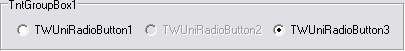
To manage more than one set of radio buttons the Unicode GroupBox Component can be used.
Notable Properties
-
Checked: Determines whether the option represented by the radio button is selected.
-
Enabled: Controls whether the radio button is enabled or disabled.
Unicode ComboBox Component

The ComboBox component is an edit box with a drop-down list. Users can select an item from the list or type directly into the edit box.
Notable Properties
-
UTF8Text: Displays the current combo-box selection.
-
UTF8Items: Lists the items (strings) in the list portion of the combo box. Use the methods of Items to add, delete and clear items, for example:
TWUniComboBox1.Items.Add(TWUniEdit1.Text)TWUniComboBox1.Items.Delete(TWUniComboBox1.ItemIndex)TWUniComboBox1.Items.Clear
Script Example
See the Unicode ListBox Component for a scripting example that can be used with the ComboBox.
Unicode ListBox Component

The ListBox displays a collection of items in a list that you can scroll. Use it to display a list of items that users can select, add, or delete.
Notable Properties
-
UTF8Items: Lists the items (strings) in the list box. Use the methods of Items to add, delete and clear items, for example:
TWUniListBox1.Items.Add(TWUniEdit1.Text)TWUniListBox1.Items.Delete(TWUniListBox1.ItemIndex)TWUniListBox1.Items.Clear
Script Example
The following script example uses a sub procedure and a function. Components used are; one Unicode button, two Unicode edit fields, one Unicode check box and a Unicode listbox.
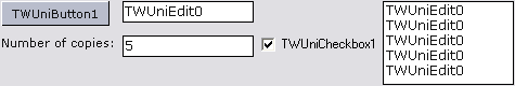
The setText function tests to see if the checkbox is checked. If it is, newText is added to the listbox the number of times given in the “Number of copies” text field (e.g. 5). If not checked the text is added once to the listbox.
The Sub procedure TWUniButton1Click calls the function setText using the text string of the TWUniEdit0 edit field as argument.
Function setText (newText) TWUniListBox1.Clear If TWUniCheckbox1.Checked Then For i = 0 To TWUniEdit1.UTF8Text -1 TWUniListBox1.Items.Add(newText) Next Else TWUniListBox1.Items.Add(newText) End If End Function Sub TWUniButton1Click(Sender) setText (TWUniEdit0.Text) End subTip: The same code can be used when working with Unicode ComboBox Component.
Unicode GroupBox Component

The GroupBox component represents a standard group box, used to group related controls on a form. When another control component is placed within a group box, the group box becomes the parent of that component.
See the Unicode Radio Button Component component for an illustration of GroupBox.
Static Image Component

A static image is often used as a background on the template or as a kind of illustration, for example a snapshot of the Viz Artist scene.
There are two ways of adding a static image to a template. One option is to add a static image component to the template and select an pre-saved image from the computer, or alternatively create a snapshot of the scene and add it to the template using Viz Engine. The snapshot is automatically appended to a static image component.
To add or edit an image, right click the static image component’s anchored frame to open the context menu and click Edit Image... .
Warning: When using the static image component, use compressed image types like JPG or lossless ones like PNG to conserve space in the Viz Pilot database. Each template and data element will save a unique copy of the image used, so keeping the image small in size is important. It does not need to be a small image in pixel size. The whole template is streamed to the database as a BLOB, and the image data will not be touched, so a JPG or PNG will use a lot less space.
Page Control Component

Add a multi page panel view with tabs. Select a page by clicking the page’s tab that appears at the top of the control. To add a new tab sheet to a PageControl object at design time, right-click the PageControl object and choose New Page. Each tab sheet that is added get its own list of parameters in the Object inspector.
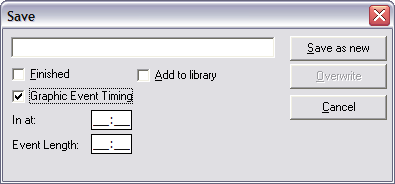
Template Information Component

Add the Template Information component to the template to customize the Save dialog for data elements in Viz Pilot News and Director.
It can be also disabled altogether and data element names can automatically be based on text in Unicode Edit, Unicode Memo and/or Wrap Fixed Unicode Memo components (using the UTF-8Text property). If other template information elements are required in the save name, they need to be filled into a text component by a script. Alternatively the SC_SaveName function can be used, as described in To add person information to the template.
Notable Properties
-
AllowEditingOfDefaultName: Determines if the user should be allowed to edit the suggested name in the save dialog.
-
DefaultSaveName: Set by the SaveNameTextFields and Separator properties.
-
Prefix: Used to set a prefix for save names.
-
SaveNameTextFields: Click the ellipsis button to bring up an editor to select the edit boxes that should be used for generating a save name.
-
Separator: Set a separator (for example a space, dot or underscore). This is used to separate text strings added to the DefaultSaveName from the edit boxes selected in the SaveNameTextFields property.
-
ShowSaveDialog: Determines whether Director should show the save dialog when saving the template.
Advanced Properties
Some of the Template Information properties are used to set a default start time and duration for a data element when it is saved using Viz Pilot News. The properties described below are primarily used with automation systems, and can only be used with Viz Pilot News.
-
DefaultStartTime: (mm:ss) Sets the start time of the data element in the playlist. The start time is relative to the start time of the playlist.
-
DefaultDuration: (mm:ss) Sets the duration of the data element in the playlist.
Note:DefaultStartTime _and _DefaultDuration always contain the current timing information for a data element. So, for example, a script could access these values and include timing information in the name of the data element when saving it.
-
ShowGraphicEventTiming: Can be set as follows:
-
stShow: Display the Graphic Event Timing checkbox when Saving an Element in Viz Pilot News. The timing properties relate to DefaultDuration and DefaultStartTime.
-
stHide: Do not display the Graphic Event Timing checkbox when Saving an Element in Viz Pilot News. In this case you can script the values and use them as part of the template.
-
stDefault: Use the Database Parameters (ax_dataelement_timer_enabled) to determine whether to show or hide the Graphic Event Timing checkbox.
Note: The stShow and the stHide value will override the database setting on a template by template basis.
-
-
TimingMode: Flag indicating the value of the Graphic Event Timing checkbox. This property only takes effect if the Graphic Event Timing checkbox is shown.
-
tmManual: Graphic Event Timing is not checked.
-
tmAutomatic: Graphic Event Timing is checked.
-
Script Example
See the Script Example (Image with Name, Unicode Edit and Template Info).
Person Information Component

The Person Information component connects to Object Store, and retrieves all available person information. It can be used to select and link information such as a person’s TV name and title to other text fields using the predefined component properties LinkName and LinkTitle. It can also be used with scripts, or simply by replacing and reassigning the ControlObjectName of the scene property to the Person Information component.
Notable Properties
-
UTF8Text: Displays the current drop-list selection.
-
LinkName: Sets the TV name property to the component selected.
-
LinkTitle: Sets the Title property to the component selected.
Using a Person Information component in a template
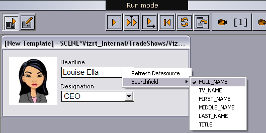
The component also has some features that are available to the template user. A context menu appears when right-clicking the drop-down list. The options are:
-
Refresh Datasource: Refreshes the data source, making new database entries available to the user.
-
Searchfield: Displays a sub menu with the following options:
-
FULL_NAME: Displays all available full names in the drop-list.
-
TV_NAME: Displays all available TV names in the drop-list.
-
FIRST_NAME: Displays all available first names in the drop-list.
-
MIDDLE_NAME: Displays all available middle names in the drop-list.
-
LAST_NAME: Displays all available last names in the drop-list.
-
TITLE: Displays all available titles in the drop-list.
-
Feed Linker Component

The Feed Linker button is a push button control. When a Feed Linker button in a template is clicked, the Feed Browser window is opened and lists the items from the feed source defined in the template. For more details see Field Linking and Feed Browsing.
When an entry is selected by the user, the data is mapped to fields in the template. This allows the user to pick an item from a feed and have the corresponding data applied to fields in the template, instead of manually typing in information. The template designer uses scripting to map the feed data to fields in the template.
The Feed Linker supports ATOM feeds as well as feeds with Viz Data Format (VDF) payloads, allowing data to be fed from sources such as Twitter, Flickr, Viz World Server or Pilot Data Server. Vizrt’s Social TV Solution also creates feeds that can be accessed using the Field Linker.
Tip: Vizrt’s Social TV Solution captures content from Twitter, Facebook, Instagram, YouTube, Flickr, Picasa, Weibo and Tudou “out of the box”, and can be configured to capture content from almost any service that provides content in the form of XML or JSON feeds. For more information, see the Social TV Solution User’s Guide.
This section contains the following topics:
-
Notable Properties
-
Events
-
To use the Feed Linker component
-
Technical
-
The Following Fields can be Linked
-
The Following Fields cannot be Linked
-
Elements in atom feed
-
Elements in atom entry
-
Script Example 1 - Mapping data
-
Script Example 2 - Mapping a name
-
Script Example 3 - Mapping Title, MediaContent and XML
Notable Properties
-
Source: Specifies the URI of the feed the user will be able to select items from.
See also The Following Fields can be Linked and The Following Fields cannot be Linked
Events
-
OnFeedItemSelected: Specifies the properties and methods that are available for mapping the feed data to fields in the template.
Properties:-
Title
-
Summary
-
ContentType
-
MediaContent(<attribute>): Returns the value of the given attribute from the main media content of the item. See Script Example 3 - Mapping Title, MediaContent and XML.
-
Xml: Returns an XML representation of the selected entry. The template designer can then extract any additional values from the item as desired by using the entry.xml property. See Script Example 3 - Mapping Title, MediaContent and XML.
-
Payload: If the item contains a payload as the main content, it can be accessed using this property. The data parameter in the OnUpdatePayload method represents a payload. See Script Example 2 - Mapping a name.
Methods: -
GetLinkWithRelation. See Script Example 1 - Mapping data.
-
To use the Feed Linker component
-
Add the Feed Linker component to a template.
-
In the Object Inspector set the Source property to the URI of a feed.
e.g. http://site.example.com/feeds/posts -
See how To add an event.
-
Double-click the event OnFeedItemSelected.
-
In the script editor, map feed data to template fields, see Script Example 1 - Mapping data.
Technical
The following XML Namespace Prefixes are used when referring to XML elements:
|
Prefix |
URL |
|
atom |
|
|
viz |
|
|
vaext |
|
|
media |
|
|
thr |
|
|
opensearch |
Example: The notation <atom:entry> is to be interpreted as referring to the same element as
<entry xmlns="http://www.w3.org/2005/Atom">.
The keywords MUST, MUST NOT, REQUIRED, SHALL, SHALL NOT, SHOULD, SHOULD NOT, RECOMMENDED, MAY, and OPTIONAL in this document are to be interpreted as described in RFC 2119.
The Following Fields can be Linked
-
<atom:author>
The personal details of the author of the selected <atom:entry>, which might be an individual person or an organization. The data is provided in child elements as follows:-
<atom:name>: The name of the author. The value of the <atom:name> element inside the first <atom:author> element that applies for the entry is recorded as the field value. This child element is required if you are specifying the <atom:author> element.
-
<atom:uri>: A URL associated with the author, such as a blog site or a company web site. The value of the <atom:uri> element inside the first <atom:author> element that applies for the entry is recorded as the field value. This child element is optional.
-
<atom:email>: The e-mail address of the author. The value of the <atom:email> element inside the first <atom:author> element that applies for the entry is recorded as the field value. This child element is optional.
-
-
<atom:content>
<atom:content>...</atom:content>
<atom:content src="..." />-
Either inline or URL content is supported.
-
There is no type match, so it is up to the Viz Pilot operator to figure out what content can be used.
-
For URL content the resource is downloaded first and then applied as the value. If you just want the URL use <atom:link>.
-
-
<atom:entry>
The whole entry XML. -
<atom:link>
This element defines a reference from an entry to a Web resource; in other words this is the value of the href attribute. -
<vaext:locator>
The text of the Vizrt Atom Extension <vaext:locator> element which has a vaext:type attribute equal to the mediatype attribute of <viz:fielddef> element in the model. -
<atom:published>
This element is a Date construct indicating the initial creation or first availability of the entry. The value of the <atom:published> element in the entry is recorded as the field value. -
<atom:summary>
This element is a Text construct that conveys a short summary, abstract, or excerpt of an entry. The content of the <atom:summary> element in the entry is recorded as the field value. -
<atom:thumbnail>
-
The value of the URL attribute of the first thumbnail element in the entry is recorded as the field value.
-
<atom:title>
This element is a Text construct that conveys a human-readable title for an entry or feed; the title of the selected <atom:entry>. -
<atom:updated>
This element is a Date construct indicating the most recent instant in time when the selected <atom:entry> was modified. The value of the <atom:updated> element in the entry is recorded as the field value.
The Following Fields cannot be Linked
-
<atom:category>
-
<atom:id>
-
<atom:rights>
-
Any other elements.
Elements in atom feed
Elements that should be present in the <atom:feed> for the full user experience:
-
OpenSearch link:
<atom:link rel="search" type="application/opensearchdescription+xml" href="http://example.com/opensearchdescription.xml"/> -
Optional, needed for support for server side searching.
-
The opensearchdescription xml file must contain a template node that returns search results as an atom feed:
<opensearch:Url type="application/atom+xml" template="http://..." />
-
-
For more details see http://www.opensearch.org/Specifications/OpenSearch/1.1
-
Up link:
<atom:link rel="up" type="application/atom+xml;type=feed" href="http://..." /> -
Optional, needed for nested collections.
-
The up link should link to the parent folder feed for hierarchical feeds.
-
The up link must have a type string equal to "application/atom+xml;type=feed".
-
Elements in atom entry
Elements that should be present in the <atom:entry> for the full user experience:
-
Self link:
<atom:link rel="self" type="application/atom+xml;type=entry" href="http://..." /> -
The self link must link to the URL that will return the <atom:entry> xml.
-
The self link must have a type value equal to "application/atom+xml;type=entry".
-
Needed for refresh/update of values from the item to work.
-
Needed in combination with the up link for remembering and showing the selected feed entry in a hierarchy of feeds (folder structure). Not needed for remembering selection in flat feeds since then the atom:id will be used.
-
-
Up link:
<atom:link rel="up" type="application/atom+xml;type=feed" href="http://..." /> -
The up link must have a href value that is the URL of the feed the entry is in.
-
The up link must have a type value equal to "application/atom+xml;type=feed".
-
Needed in combination with the self link for remembering and showing the selected feed entry in a folder structure.
-
-
Down link:
<atom:link rel="down" type="application/atom+xml;type=feed" href="http://..." /> -
Needed if this <atom:entry> is to be considered a subfolder instead of a normal <atom:entry>.
-
The down link must have a type value equal to "application/atom+xml;type=feed".
-
The down link must have a href value that is the URL of the feed (folder) the entry represents.
-
Link may contain thr:count attribute (RFC4685) indicating how many children there are. If the value of thr:count is 0 (zero) then the folder will not be loaded since it is empty. This is an optimization.
-
-
Thumbnail link:
<media:thumbnail url="http://..."/> -
Needed for thumbnail icons to display on the entries in the feed browser.
-
The URL value must reference a JPEG or PNG image resource.
-
If many thumbnails are defined the first one will be selected as the default. This is according to Media RSS Specification Version 1.5.0.
-
-
Locator
<vaext:locator type="application/vnd.vizrt.viz.geom">GEOM*Vizrt/Tutorials/VizPilot/...</vaext:locator> -
Needed to be able to link a tabfield to a locator. A locator is a path that is not representable with the URI href in an <atom:link>. The selected value is the text node in the locator, so it can in theory be used for any kind of text.
-
For Viz Pilot it is meant to be used to select paths to resources that are not URIs, like the resources on the Graphic Hub that is currently in use.
-
The type must match the tabfield type.
-
The value from the first locator that matches will be used.
-
If no locators matches an error message will be logged in Viz Pilot.
-
The Viz Engine types are:
-
-
TEXT: text/plain
-
RICHTEXT: application/vnd.vizrt.viz.richtext+xml
-
MATERIAL: application/vnd.vizrt.viz.material
-
DUPLET: application/vnd.vizrt.viz.duplet
-
TRIPLET: application/vnd.vizrt.viz.triplet
-
FONT: application/vnd.vizrt.viz.font
-
CLOCK: application/vnd.vizrt.viz.clockcommands
-
GEOM: application/vnd.vizrt.viz.geom
-
IMAGE: application/vnd.vizrt.viz.image
-
AUDIO: application/vnd.vizrt.viz.audio
-
VIDEO: application/vnd.vizrt.viz.video
-
MAP: application/vnd.vizrt.curious.map
-
TRIOSCROLL: application/vnd.vizrt.trio.scrollelements+xml
-
-
Other links:
<link rel="..." href="http://..." type="..."/> -
Needed in order to select the URL to external resources. This can be images, videos, text, and so on.
-
Limitation 1: The atom 1.0 specs allow multiple links with the same relation, but when linking a tabfield to a link in Viz Pilot, only the first link will be selected.
-
Limitation 2: Viz Pilot can only use the href URL as the value. It cannot download the resource at the URL and use its contents as the value. The Viz Engine control plugin for the property has to be able to understand the URL and download the resource.
-
Script Example 1 - Mapping data
Link data (Title, Summary, ContentType) from a news feed to editbox fields in a template, including getting the link of the feed item itself using GetLinkWithRelation.
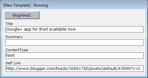
Sub TWFeedLinker1FeedItemSelected(entry) SetUnicodeValue TTWUniEdit1, entry.Title SetUnicodeValue TTWUniEdit2, entry.Summary SetUnicodeValue TTWUniEdit3, entry.ContentType SetUnicodeValue TTWUniEdit4, entry.GetLinkWithRelation("self") End subScript Example 2 - Mapping a name
Link a person’s TVname in a person feed to an editbox in the template.
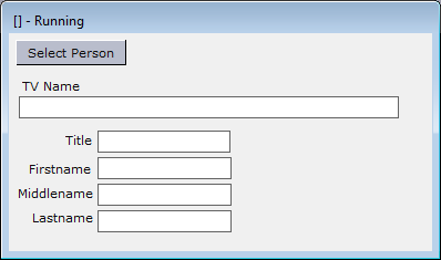
Sub TWFeedLinker1FeedItemSelected(entry) set payload = entry.Payload tvnameedit.text = payload.Item("tvname").Value titleedit.text = payload.Item("title").Value firstnameedit.text = payload.Item("firstname").Value middlenameedit.text = payload.Item("middlename").Value lastnameedit.text = payload.Item("lastname").Value End subNote: The TTWUniDbPersonComboBox component can also be used to map person name, but it only supports data from the Object Store. The Feed Linker component supports all asset search providers (e.g. RestVOS and Viz One).
Script Example 3 - Mapping Title, MediaContent and XML
Link text, images and XML from feed data to a template.
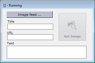
Sub TWFeedLinker1FeedItemSelected(entry) TTWUniEdit1.Text = entry.Title set media = entry.MediaContent if not isnull(media) then TWImageInf1.picFilename = media.Url TWUniEdit1.Text = media.Url TWImageInf1.UpdateThumbnail end if TWUniMemo1.Text = entry.xml End subNote: If images are linked in using the method in this example script, then all Viz Engines must have internet access. See the Viz Artist and Viz Engine guides for more information on supported image formats.